Key points
- Even after the recent price falls, the ‘CAPE’ ratio for the US share market is still a very high 33.6, indicating the market is still around 100% over-priced relative to underlying real earnings.
- Only a fall of around -50% (like the 2000-2 tech-wreck, or the 2008-9 GFC) would bring the US market back to ‘fair value’ on this measure.
- But CAPE is a pricing measure, not a timing tool. In prior cycles, the market has kept running higher for many years before finally crashing – eg in the 1920s and the 1990s.
- A high CAPE ratio indicates high vulnerability and sensitivity to negative shocks. The current environment is producing a few of those!
Where are we now?
Here are my updated charts on the ‘Cyclically Adjusted Price/Earnings ratio’ (‘CAPE’) for the US share market as of 25 April 2025, following the mini-correction from the 19 February high point.
For many decades, this has probably been the most widely followed measure of fundamental pricing/valuation of share markets, and the most reliable proven predictor of future long-term returns. For a background on the CAPE ratio and how it is constructed and interpreted – refer to notes at the end of this article.

Section A shows the broad US share market price index since 1900 (S&P500, Cowles, CRSP) – highlighting the main booms & busts.
Section B shows the CAPE ratio from the end of each calendar quarter – showing the peaks at the tops of booms prior to the busts. The current ratio for the US market (red line) is 33.6. This is around twice the long-term historical average of 16 for the US (red dotted line).
Section C shows the forecast 10-year average annual total return starting from each point in time (black line), and the actual subsequent 10-year average annualised return from each point (light blue line). These two lines track each other quite closely. The forecast subsequent returns and actual subsequent returns from each point are both either above the line together (better than average returns following low CAPE scores) or they are both below the line together (below average returns following high CAPE scores).
To the very right of section C - the current forecast average annualised returns from using the CAPE model is just 3% pa, which is very poor, due to current very high CAPE ratio.
Note that all statistical regression models like this run the risk of creating a false sense of accuracy. All that we can really say is that it is highly likely that the subsequent returns from this point (high CAPE) are going to be well below average.
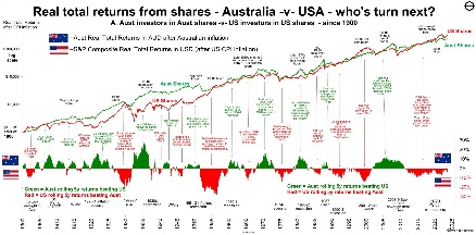
Australian market
The CAPE ratio for the Australian share market is lower than the US, but still well above its historical average. When (not if) the big US correction hits, the Australian market will also fall as foreign investors pull their money out, and local investors also panic sell.
When the US market falls, for whatever reason, the Australian market also falls with it, regardless of local pricing and conditions. (The last time the US market suffered a big fall that was NOT echoed in Australia was the ‘Panic of 1907’).
However when the US market falls to end the current US tech boom, the local Australian market will mostly likely fall by less (as was the case in the 200-2 tech wreck). We take turns having the bigger boom then the bigger bust. The US had a bigger boom this time, so they will have the bigger bust. Then it will be our turn next!
Correlations between CAPE ratio and subsequent 10-year average returns
Section D on the main chart shows the rolling 10-year correlation between the CAPE ratio and subsequent returns (red), and the cumulative average correlation (blue dots). The correlations are strongly negative almost all of the time – ie low CAPE ratios are almost always followed by above average returns, and high CAPE ratios are almost always followed by below average returns.
There were only two exceptional periods when the strong negative correlation between CAPE ratio and subsequent returns was not present – in the ‘Panic of 1907’, and again at the start of the 1990s boom. Both of these were errors of timing only, and in both cases the usual strong negative correlation returned just one year later.
Here is a plot diagram showing the close correlation between the CAPE ratio at the end of each quarter (horizontal axis) and subsequent 10-year average annualised returns from the US share market from each point:
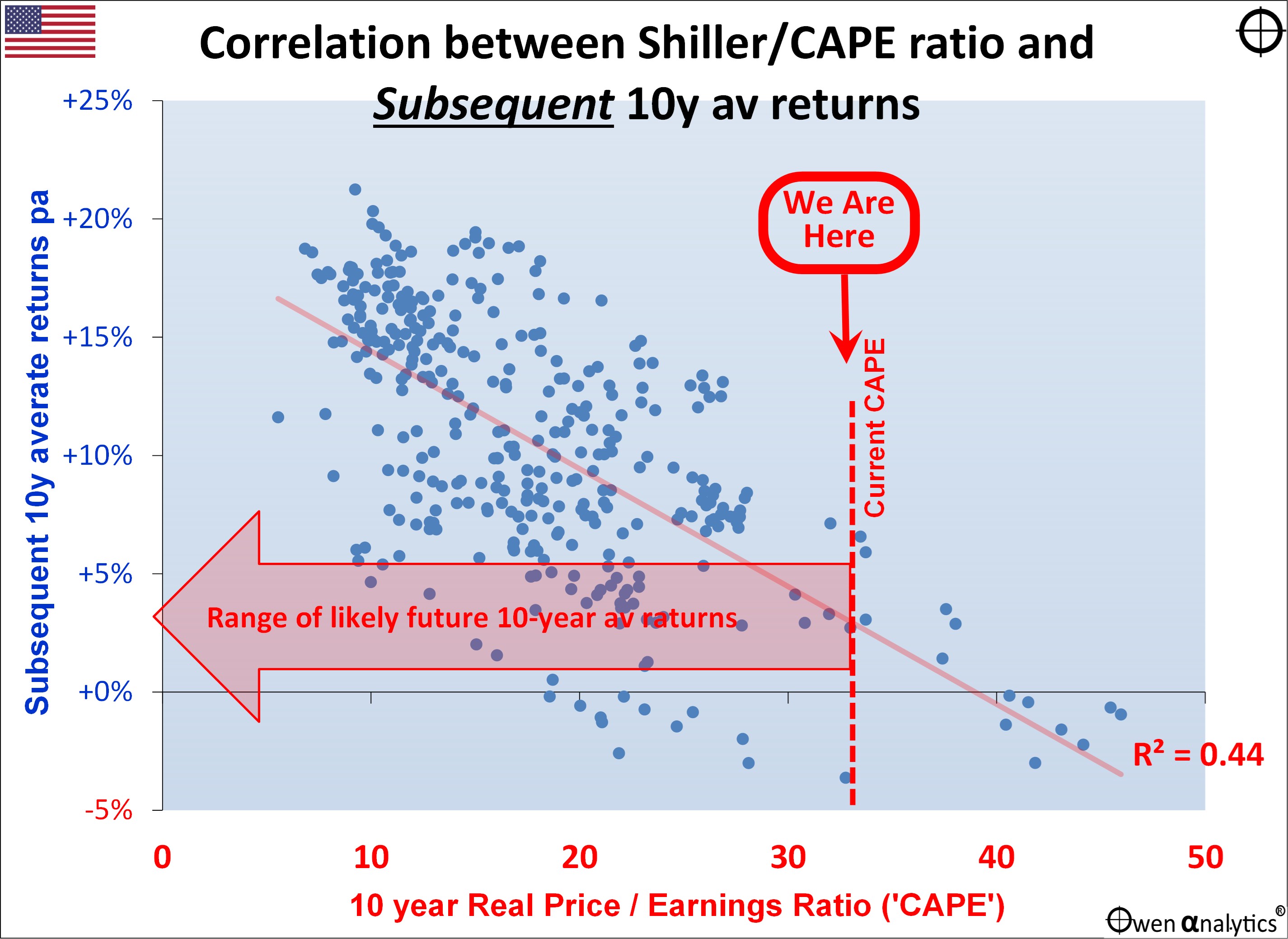
The cluster of dots in the upper left segment represent the 10-year periods of HIGH returns (above say 15% pa), and these were almost all achieved following LOW CAPE ratios (below around 15 along the horizontal axis).
Conversely, the cluster of dots in the lower right segment represent the 10-year periods of LOW returns (below 5% pa), and these were all achieved following HIGH CAPE ratios (above say 35 on the horizontal axis). In the far lower-right are the negative subsequent 10-year returns following the quarters when the CAPE ratios were above 40 at the top of the late 1990s ‘dot-com’ boom. That was the only time US CAPE went above 40.
The current CAPE ratio (vertical red dotted line) is pointing to very low average returns over the next 10 years. This is indicated by the large horizontal arrow, which is deliberately broad to indicate a range of returns, rather than a specific number. This is a broad indicator of likely subsequent returns, not a precise forecast.
Long-term -v- short-term outlooks
Although the current CAPE ratio for the US market is still very bearish for long term returns from current levels, a high CAPE ratio, even if extremely high, is NOT a warning of an imminent correction. It is a pricing measure but not a timing tool.
The CAPE ratio is a long-term model, so it provides NO guidance at all on short-term or medium-term returns along the path to the 10-year forecast return. It just says that average returns over next ten years are probably (with a very high degree of confidence) going to be well below average from the current starting point.
As a sanity check for this forecast for very low returns from US shares for the next decade from current levels, it is entirely consistent with my report on the average returns from different asset classes in Low, Moderate and High inflation environments:
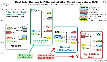
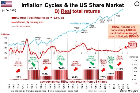
Both of these analyses show that my forecast for well below average returns from the CAPE ratio model are more or less the same as historical returns from the US share market in Moderate and High inflation conditions. The golden era of above average returns in 'Low' (ie sub 2%) inflation years – which fuelled the post-GFC US tech boom - is well and truly over.
Recent high CAPE ratios immediately before big falls
At the end of December 2021, immediately before the -25% correction in during January to October 2022, the CAPE ratio for the US market was at a post-dot-com high of 39.6. At that extreme level, any serious shock would have been enough to trigger a big fall. As it turns out, the -25% correction in 2022 was triggered by the aggressive rate hikes from the Fed to attack runaway inflation, and Russia’s invasion of Ukraine.
Prior to that, at the end of December 2019, right before the -34% Covid sell-off, the US CAPE ratio was a very high 31.2. The 34% correction was triggered, of course, by the sudden and unprecedented nationwide Covid lockdowns by governments everywhere.
NB. The pre-COVID CAPE ratio of 31 was similar to what it was in September 1929 immediately before the 1929-32 crash. The only time when the CAPE ratio was higher was at the end of 1999 at the dot-com peak before the ‘tech wreck’.
With extremely high pricing, the trigger for correction could be anything
Prior editions of this report noted the warnings from those high CAPE ratios in December 2019 and December 2021, right before the sell-offs in 2020 and 2022. The CAPE ratio (and my reports) did not predict the Russian invasion of Ukraine, nor the Covid crisis of course. I didn’t need to predict the trigger. All I knew was the share market was vastly over-priced and highly vulnerable to a big correction, just waiting for a trigger to set it off.
Although this CAPE ratio measure has a long history and following, it is just one measure. I report on a variety of other measures and other approaches in other articles.
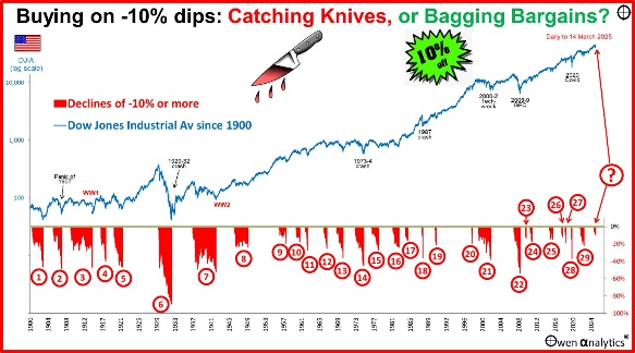
For my report on the 31 previous 10% dips on the US share market – what happened after the dips and why -
For my most recent monthly update on global markets for Aussie investors:
Background on ‘CAPE’
The Cyclically Adjusted Price/Earnings Ratio was pioneered in the 1930s and 1940s by Ben Graham (Columbia University professor and Warren Buffett’s professor, first boss, and mentor). The groundwork was laid in Graham and Dodd’s 1934 book ‘Security Analysis’, and it was made popular by Robert Shiller (Yale professor and 2013 Nobel Prize co-winner) in the 1980s. Shiller provides regular data updates here.
It is based on the notion that in the traditional ‘p/e’ (price/earnings) ratio, the ‘e’ is just the most recent 12-month aggregate earnings (profits), which can be distorted by a range of factors including economic cycles, tax changes, accounting rule changes, management fudges, and one-off events.
The ‘cyclically adjusted ratio’ uses a long-term rolling averages (usually over periods of 7 or 10 years) of aggregate corporate real earnings, in order to smooth out cyclical volatility, and also adjusts for inflation.
It is sometimes known as the ‘Shiller’ ratio, or the ‘Graham and Dodd‘ ratio.
The ratio has proven to be a relatively reliable predictor of subsequent (ie future) returns over long holding periods (eg at least 7 years), and it has worked for many decades through a variety of different economic and market conditions.
Thank you for your time and interest. ‘Till next time . . . safe investing!