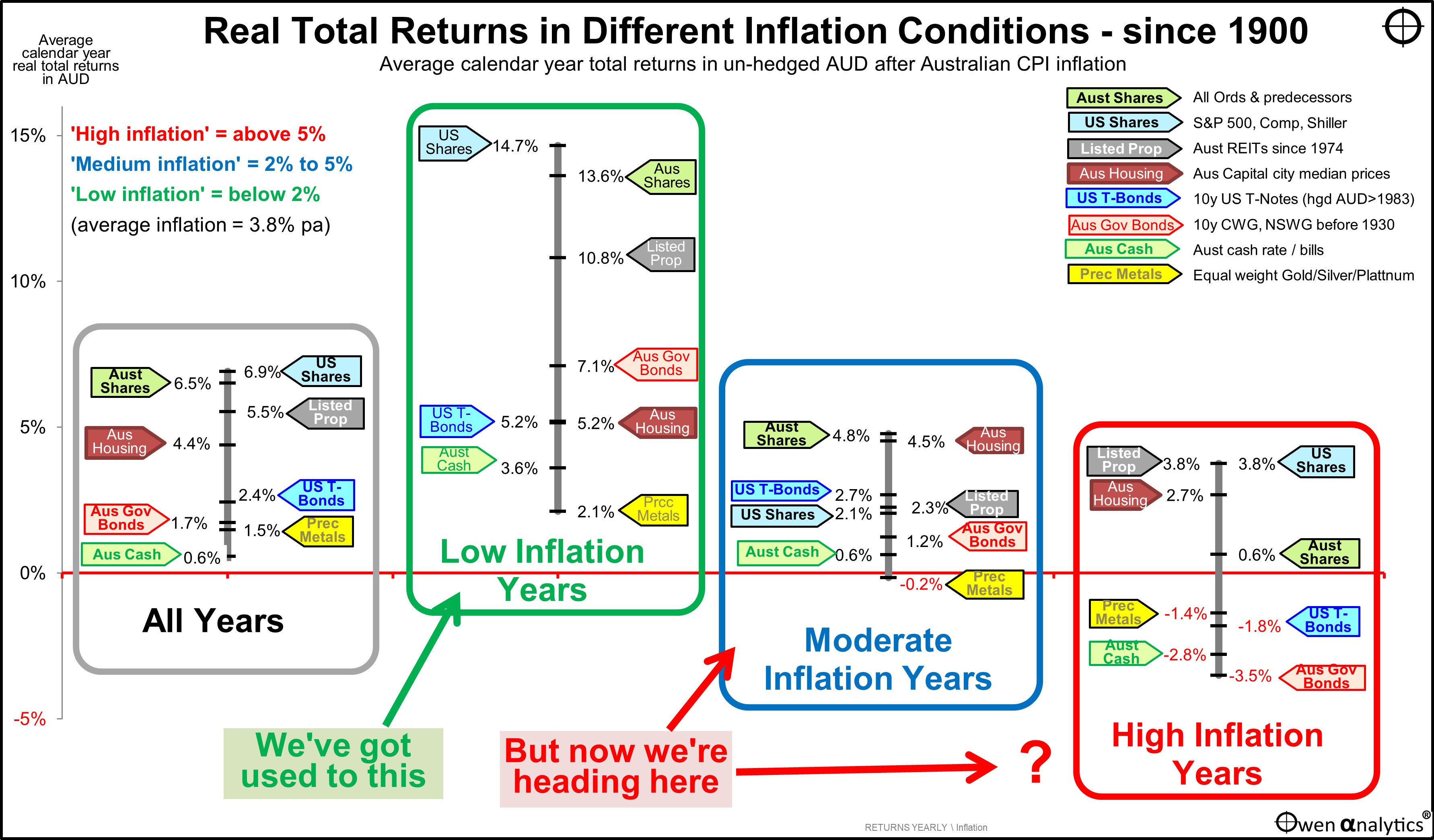
Today’s chart is the single most important chart for anyone investing for the next decade and beyond.
Investors enjoyed unusually high returns in the past couple of decades because every asset class posted above average returns in the low inflation era we have just enjoyed.
A blind-folded monkey with a dart board full of ETFs for each asset class would have done well because every asset class posted above average returns, and so any random combination of asset classes would have posted good returns.
Unfortunately, that wonderful era of great returns from low inflation is over.
The structural shift from recent decades of low inflation into a new world of higher, even if ‘moderate’ or ‘average’ inflation is probably the single most important issue for portfolio construction and asset allocation that will determine future investment portfolio outcomes.
Why? Because every investment asset class performs very differently in different inflationary conditions.
Can’t extrapolate the recent past into the future
Many investors, advisers, and portfolio managers have only experienced the recent glorious era of low inflation and interest rates. They have come to believe that low inflation and interest rates are normal, and will continue to deliver above average returns forever.
Unfortunately, that is probably not going to happen.
We can't simply extrapolate recent above-average returns into the future. We need to understand what types of conditions gave rise to the returns we have achieved in the past, and ask what types of conditions we are likely to experience in the future.
A broader look at history tells us that each of the major asset classes has generated above average returns - in both ‘nominal’ (headline) terms, and ‘real’ (after inflation) terms - in periods of low inflation, and below average nominal and real returns in periods of high inflation.
Today's chart shows average annual ‘real’ (after inflation) total returns (ie price gains plus income) from eight major asset classes since 1900.
We focus on ‘real’ returns because we need to generate future wealth and incomes ahead of inflation in order to preserve our purchasing power and living standards.
Here we include:
- Australian housing (capital city median house prices),
- Australian 10-year government bonds (NSW bonds before 1930),
- US 10-year Treasury notes (Australians call them ‘bonds’) (in hedged AUD since 1983),
- Australian cash (short term deposits),
- Precious metals (we use an equal-weighted basket of gold, silver, and platinum, because holding gold was illegal for a large parts of the period),
- Australian listed property trusts (since 1974 when index data is available). (Australia is the only country in the world where listed property (‘REITs’ or ‘LPTs’) are considered a separate asset class, so we include them here.)
All returns are since 1900 (except listed property trusts are since 1974). Returns are to December 2023.
All returns are expressed un-hedged Australian dollars, in real terms after Australian inflation, but before fees and taxes. The exception is US treasuries (bonds) which are in hedged AUD since the AUD float in 1983, and un-hedged AUD before that, because FX hedging was not available before the AUD float and lifting of capital controls in December 1983.
(We use US shares and bonds as proxies for ‘international’ shares and bonds because the US market has been the largest, deepest, and most accessible international market for foreign investors, and it has the longest continuous history. When we look at shorter periods – eg since 1980, etc – we can include all sorts of other asset classes and countries, but here we look at returns since 1900 because it covers several inflation cycles.)
The chart has four sets of asset class returns.
Overall average returns
In the far left-hand box are average annual real total returns per asset class over the whole period, ranked from highest to lowest.
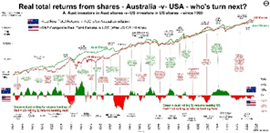
At the top of the tree, the Australian and US share markets have both generated average annual real total returns of around 6.5% pa. (The US market has temporarily moved ahead of Australia in the current tech boom but that will reverse when, not if, the tech boom unwinds).
See also: Australia v US share markets – it’s our turn next
Next best real returns were from Australian listed property trusts (since 1974), then Australian housing. Shares and real estate have demonstrated reasonably high degrees of inflation protection over the whole period, with average returns well above inflation.
Lower down the return tree in the left box, Australian and US government bonds, and precious metals, have each posted low real returns above inflation over the whole period.
Cash is at the bottom, barely above inflation.
These returns over the whole period are as per the expected pattern. However, things start to get very interesting in the other three sets of returns on the chart.
‘High’, ‘Moderate’, and ‘Low’ inflation
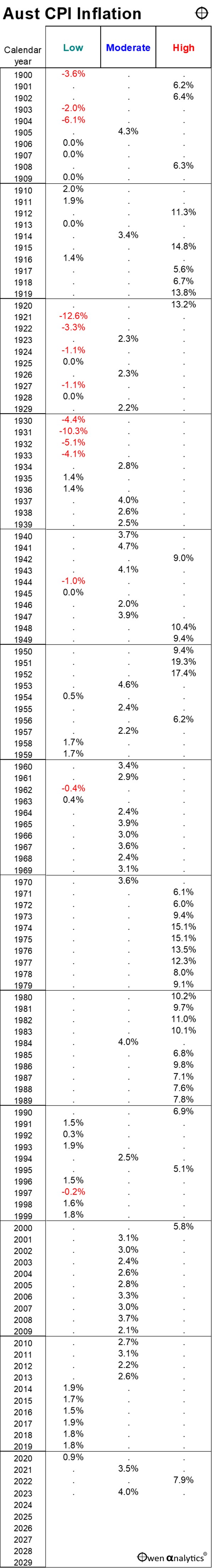
Since 1900, Australian CPI inflation has averaged 3.8% per year, but this has ranged widely from a high of 19% inflation in 1951 (Korean War inflation spike), down to negative -12% (price deflation) in 1921 (post-WW1 slump).
For a full picture on Australian inflation cycles since the 1850s, see: Dr Don Stammer's 60 years of investing
For this exercise we divide all calendar years since 1900 into ‘high’ inflation years, ‘moderate’ inflation years, and ‘low’ inflation years:
-
- ‘High inflation’ – the top one third of years, when inflation was above 5%,
-
- ‘Moderate inflation’ – middle one third of years, with inflation between 2% and 5%,
-
- ‘Low inflation’ – bottom one third of years, with inflation below 2%.
(For reference, a table of Australian CPI inflation per calendar year since 1900 is included at the end of this article. You will see that even in the 'moderate inflation' 2000s decade, inflation ran in bottom half of our 2% to 5% 'moderate' range, well below 5%.)
Very different returns with low, moderate, and high inflation
The first thing that stands out from this chart is that the real (after inflation) returns from all types of investments are significantly higher than average when inflation is low (second box from left), but returns are significantly lower than average when inflation is high (right box).
No effective inflation hedge
A second outcome is that no asset class has offered an effective ‘inflation hedge’ that performs better when inflation is higher, not even precious metals. All investment asset classes post lower real returns when inflation is high.
Housing the most consistent
The only asset class that has generated reasonably consistent real returns in all inflationary conditions has been Australian housing. The red maroon markers are at more or less similar levels of real returns – around 3% to 5% above inflation - across the four segments of the chart. (For this exercise we use major capital city median house prices).
However, the performance of housing relative to other asset classes has been very different. In low inflation years, housing is near the bottom of the tree, but in moderate and high inflation years, it has been near the top.
Why Australian housing?
The Australian housing market is almost unique in the world. It has benefited from high levels of population growth, mainly immigration (Australia has had the highest population growth rate in the world since 1900, outside of Africa), extreme concentration in a small number of large cities (highest urbanisation rate in the world aside from some small city-states), limited supply, and significant tax advantages (exemption from CGT, pension entitlement tests, etc).
(The Australian housing market is very different from the US and most other countries, for a variety of reasons).
Also note that median house prices are not a reliable measure of investment performance. Every house is different, and the returns do not include the costs of renovations, re-building, repairs, maintenance, etc. A median house in past generations is nothing like a median house today. We include it in this exercise only because most of the ‘wealth’ in Australia is in housing.
Ranking of asset class returns is similar in all inflation conditions
Another important and unexpected feature that stands out from the chart is that the ranking of returns between different asset classes has been quite similar in all types of inflationary conditions.
Shares and property have done better than bonds and cash in all inflationary conditions, while precious metals are always near the bottom of the table, with relatively low real returns.
(Although, in high inflation years, precious metals have beaten bond and cash, but still posted negative real returns on average – hardly an ‘inflation hedge’).
Shares on top – in all inflation conditions
We can see that share markets have provided the highest real returns in all inflationary conditions, including providing the best inflation hedge in high inflation years.
The Australian and US share markets have both returned a very healthy 6.5% above inflation over the whole period, but returns were different in different inflation environments. In low inflation years, Australian and US shares returned around double their overall average returns, but in high inflation years their returns were much lower than average – virtually zero from Australian shares, and less than 4% pa for US shares (in Australian dollar terms).
Outlook for inflation
Because no asset class has offered an effective ‘inflation hedge’ that performs better when inflation is higher, when planning an investment strategy to generate real returns over the next say 20-30 years, we need to form a view on future inflation.
After the wonderful recent decades of low inflation, inflation has now returned.
What revived inflation this time was the unprecedented floods of ultra-loose monetary and fiscal stimulus measures, that were too generous for too long, plus some temporary supply restraints in the government-imposed Covid lockdowns.
Those temporary factors were what kick-started inflation, but that there were already several deeper forces at work that will lead to a structural shift that suggests that the recent low inflation era is now over.
Long-lasting structural shifts to higher inflation
It is reasonably certain that the past 30 years of disinflation (declining inflation) and low inflation are over. Why? Because many of the factors that drove the recent low-inflation boom in Australia and around the world have stalled and/or reversed:
- Globalisation, tariff reductions, and free trade ideology are being replaced by rising protectionism, ‘made at home’, subsidised self-sufficiency, and ‘friend-shoring’,
- ‘Just-in-time’ supply chains are being replaced by ‘just-in-case’ – increasing costs and requiring more capital,
- Hands-off, laissez-faire, economic rationalist governments are being replaced by hands-on, interventionist, centrally controlled governments,
- Steadily increasing size of the non-market-based government sector in almost every country, relative to the market-driven private sector,
- Deregulation and unfettered flexibility (eg financial and labour markets) are being replaced by re-regulation and decreased flexibility,
- Productivity growth that was high in the reform-driven 1980s and 1990s has been replaced by stalled productivity growth, with not even a hint of productivity growth in wage negotiations,
- Central banks that gained ‘independence’ in the 1990s are losing, or have lost, much of their independence in many countries and are now just another arm of government politically-driven agendas,
- Tax cuts that drove profits and spending in recent decades cannot continue at the same pace, and taxes may need to rise to pay for big government deficits and debts, including populist taxes on the rich,
- Pluralist, tolerant democracies are becoming more populist, extremist, xenophobic, nationalist,
- Reform-driven government policies of the 1980s and 1990s have been replaced by populist, short-term vote-buying policies,
- Tolerance to immigration to increase demand and suppress wage growth, is being replaced by populist, xenophobic/racist backlashes against immigration,
- Favourable demographics with abundant labour forces in the 1980s and 1990s following the post-WW2 baby boom have turned into aging populations where workers are a smaller proportion of the population, giving them more wage bargaining power, leading to higher wages with no productivity trade-offs,
- The ‘peace dividend’ with declining military spending with thawing of the NATO-Soviet cold war, has been replaced by new global cold war, and escalating military build-ups everywhere. (Throughout history, military build-ups and wartime spending have been the main causes of general price inflation).
- The tech sector’s low demand for savings/capital is being overtaken by highly capital-intensive, government- sponsored renewable energy infrastructure and social infrastructure spending, where increased demand for savings/capital increases interest rates.
- Higher capital requirements for banks, increasing demand for savings/capital.
Even if inflation returns to the ‘moderate’ or average range, one thing is certain: nominal and real returns from all asset classes are probably going to be lower in the next couple of decades than they were in the past couple of decades.
Building a ‘CPI+4%’ portfolio
Pension/retirement funds and other long-term or perpetual funds (eg charities) typically design portfolios targeting average total returns around 4% above inflation (‘CPI+4%’).
A diversified CPI+4% portfolio (after fees and taxes) can be expected to be able to keep growing for inflation after 4% withdrawals each year (or rising withdrawals over time as beneficiaries age), so that the withdrawals, and the balance after withdrawals each year can keep pace with inflation.
In the past three decades of low inflation, building a CPI+4% portfolio was easy. A blind-folded monkey with a dart board full of ETFs for each asset class could have done it!
Take a look at the ‘Low Inflation Years’ box. Literally any combination of shares and bonds would have more than beaten CPI+4% handsomely, even ‘Conservative’ portfolios containing loads of bonds and cash.
Now look at the ‘Moderate Inflation Years’ box. How do you build a CPI+4% portfolio with that?
Life for investors, advisers, portfolio managers, and investment committees just got a lot harder!
Beware of complex ‘solutions’
The answer is not ‘private assets’, ‘hedge funds’, ‘unlisted infrastructure’ or other so-called ‘alternative assets’. They just contain the same underlying assets (equity and/or debt interests in businesses and real estate), but with extra hidden layers of sales commissions, fees, leverage, derivatives, counter-party risks, conflicts of interest, opaqueness, and with much lower levels of liquidity, scrutiny, and regulation.
Some products might do well for a while, then they suddenly don’t. We have no idea what’s in them, or what makes them do well in what types of conditions.
Passive index funds
The passive index funds industry, mainly exchange traded funds (‘ETFs’) was the main beneficiary of the recent low inflation era because you didn’t need to be ‘active’ or do anything to get great returns. Just buy everything in the index then go to lunch and play golf!
Great passive returns from every asset class led to the enormous growth of ETFs in the low inflation era, but that will obviously not work in future if inflation is no longer low.
But 80-90% of 'active' funds under-perform
Numerous studies have shown that the vast majority of active fund managers in every asset class in every country under-perform the asset class index they are trying to beat.
Remember that the asset class returns in today’s chart are before fees, so you should deduct around 0.1% to 0.2% pa fees for ETFs, or around 0.5% to 1% pa for ‘active’ funds.
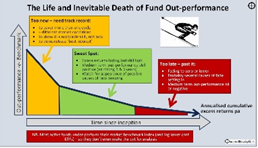
Although it is true that most active funds under-perform their asset class index overall, a good portion of them do actually beat their asset class index in the early years when they are small, nimble, and ‘hungry’. Many start off with a bang at the start (they need to do well initially to be able to raise money to start the fund), but they inevitably lose whatever ‘edge’ they have.
The ‘winners’ to well until they don’t. And they NEVER get their edge back. They just turn into expensive index funds. The trick is to find good active fund managers while they still have an ‘edge’ and add value, then dump them when they lose it (they ALL do).
For more on active funds see:

Active asset allocation
While picking stocks/bonds within each asset class has proven elusive for ‘professional’ active fund managers, selecting which combinations of asset classes to hold when and where is a very different ball game.
In each of the inflation boxes in the chart, the asset class rankings are similar. But those are their average returns over dozens of years. However, returns from each asset class differ very greatly from year to year. For example, here are the returns from 23 different asset classes and sectors each year since 2000:

Understanding how different types of assets perform in different kinds of market conditions, and understanding when they are over-priced or under-priced, are critical in navigating the new world we are in now.
One thing we can say for certain is that investing in the next decade or so will be very different from our experience over the past decade or so.
‘Till next time – happy investing!
Thank you for your time – please send me feedback and/or ideas for future editions!
Table of Australian CPI Inflation per calendar year since 1900: