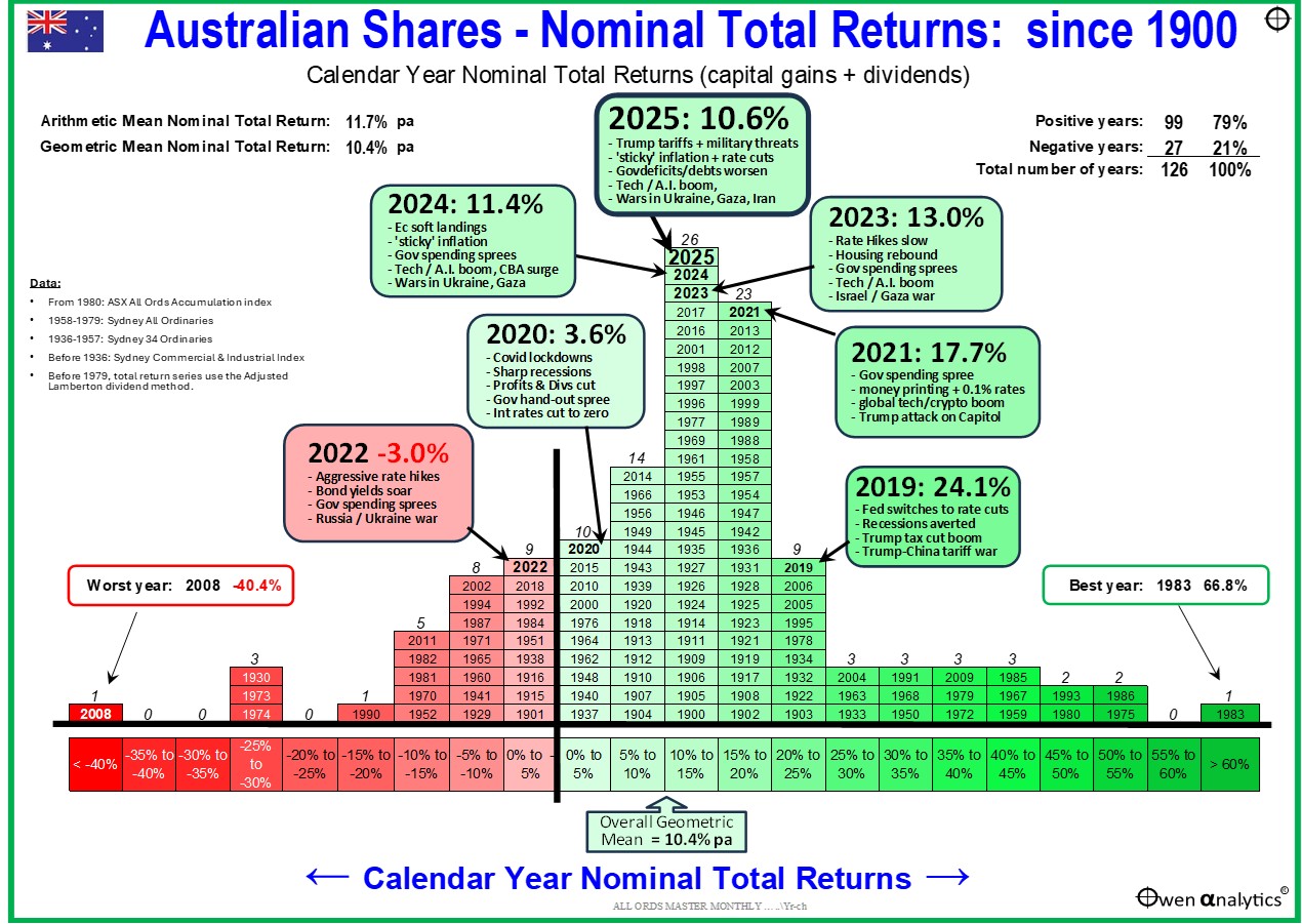
Here’s my updated annual return pyramid for the Australian share market. It’s one of my go-to charts to illustrate the overall shape and spread of returns over time.
Key points:
- 2025 was another good year of spot-on historical average returns for the broad Australian share market, despite seemingly endless scare mongering from media and so-called ‘experts’.
- That makes it three years in a row of good/boring/average returns – the longest period of consistently boring/average returns in history!
- If you were an astronaut away from the planet for the past three years, you would wonder why all the fuss about Trump, tariffs, government shutdowns, bank failures, government deficits/debt crisis, and endless nonsense about unprecedented ‘volatility’ and ‘uncertain times’.
- You can’t use this chart to predict the future of course. But it does illustrate the power of sticking to a long term strategy using shares by ignoring the constant barrage of temporary noise.
In my Aussie share market annual return pyramid chart, each box represents a calendar year since 1900, with the years organised into 5% return bands based on total returns (ie capital gains plus dividends) from the broad Australian share market. The worst years are at the left, through to the best years to the right.
2025 - good/average returns – again
2025 was another good year of spot-on historical average returns for the broad Australian share market, despite seemingly endless scare mongering from media and so-called ‘experts’ about tariffs, wars, impending recessions, bubbles, crashes, etc.
The All Ordinaries Accumulation index returned 10.6% in calendar 2025. This is spot-on the overall ‘geometric‘ (compound) average nominal total return from the broad Aussie market since 1900. (The ‘arithmetic’ average has been 11.7% pa.)
Other broad measures for the ASX: the ASX300 returned 10.7% in 2025, and the ASX200 returned 10.3%, but for long term analysis like this I tend to use the All Ords, which returned 10.6%.
Note that for this purpose I exclude franking credits, which boosted returns by +1.2% in 2025 for tax-free Aussie investors. (For data definitions and sources, see notes at end of this report.)
‘Average’ for Australia is actually best in the world long-term!
It is important to note here that ‘average’ returns on the Australian share market are actually the best average share market returns in the world over periods of a century or more – along with the US.
Australian shares have beaten almost every other country in the world over the past century plus, thanks to our relatively high population growth, pro-growth governments, favourable demographics (yes, even now!), resource abundance, remoteness from foreign wars, absence of civil wars and foreign invasions, and political stability.
The most boring average three years in history!
Not only did 2025 end up with boring/average returns spot-on historical average returns despite all the scare-mongering media headlines, 2025 was actually the third year in a row of boring/average returns. The past three years stand out as being the longest period of consistently boring/average returns in history!
The only other three year period in history of boring/average returns was 1996-1997-1998 (‘dot-com’ boom), but returns in those years (13.4%, 14.7%, 10.3%) were a fraction more varied than the 13.0%, 11.4%, and 10.6% in 2023-2024-2025.
Despite the endless flood of nonsense in the media warning of ‘volatility’ and ‘unprecedented uncertainly’, the Aussie share market has never been more consistently boring / average in its entire history!
Ho hum – why all the fuss?
Imagine you were an Aussie astronaut shooting off into space three years ago for a three year trip, and you had a portfolio or ETF for the broad ASX share market. You would know that textbooks say that the ASX share market returns an average of around 10-11% per year, subject to temporary ups and downs along the way.
You return to earth at the end of 2025 and ask what the returns were on your broad Aussie share market ETF for the three years you were away. Turns out the returns were almost exactly the historical average EACH YEAR!
You may ask, “So, what was all that media fuss I heard about Trump, tariffs, wars, invasions, inflation spikes, rate hikes, recession scares, bond sell-offs, bank collapses, US government shut-downs, governments everywhere running massive deficits and debts, rising military tensions, fracturing politics and riots everywhere?”
Dunno. Just ignore it!
Good years and bad years
Although the broad Aussie share market has returned an average of 10-11% per year overall for more than a century, the chart shows that the returns each year have ranged from very deep negative years to very large positive years.
The worst year was 2008, with a return of minus 40%, in the depths of the 2008-9 ‘Global Financial Crisis’ triggered by the US sub-prime collapse. The 2008 negative year came after five consecutive years of strong gains in the 2003-7 China/credit boom.
The best single year was 1983, with a return of +67% in the tremendous rebound out of the early 1980s recession, which had caused negative years in 1981 and 1982.
Mostly positive
This great for illustrating the fact that the great majority of years have been positive for the overall share market - the green boxes on the right half of the chart.
- 79% of years were positive
- 60% of years were above 10%
- 21% of years were above 20%
- Only 21% of years were negative, and only 8% of years were worse than -10%.
Very high positive returns and very low negative returns are relatively rare.
Most of the years are bunched in the ‘boring’ middle third of the chart. The most popular 5% return range is 10-15%, with 26 years. The past three years (2023, 2024, 2025) are in this column.
The past is past
That is the past, and the past cannot be extrapolated into the future of course. 2026 might produce returns anywhere across the chart ranging from :
-
-
- from a big gain – the current ai booms accelerates even more frenzied territory
- or a big loss – the boom will collapse one day of course, sooner or later.
- Or another average-ish year in the middle somewhere.
The purpose of this chart is NOT to predict the future. The aim is to illustrate:
-
-
- the wide dispersion of returns over time,
- (2) returns are positive an overwhelming majority of the time; and
- (3) the power of sticking to a long term strategy using shares, by ignoring the constant stream of temporary noise, scare-mongering media headlines and endless predictions of doom from so-called ‘experts’.
How do we rate in the world?
The Australian share market lagged most international share markets again in 2025 – I cover this in my recent rundown of global share markets –
‘Real’ returns after inflation?
The above article relates to ‘nominal’ total returns (ie price gains plus dividends), but they do not take into account the wealth-destroying effects of inflation. I cover real returns after inflation in my next story coming soon.
‘Till next time. . . . safe investing, and stay healthy!
Further reading -
For my 2025 year-end wrap-up of local & global markets for Aussie investors:
For asset class returns for the past 35 years including 2025, see –
For an update on my current BIG challenge -
A note on Data sources:
- From 1980: ASX All Ords Accumulation index
- 1958-1979: Sydney All Ordinaries
- 1936-1957: Sydney 34 Ordinaries
- Before 1936: Sydney Commercial & Industrial Index
- Before 1979, total return series use the Adjusted Lamberton dividend method.