The 'Cyclically Adjusted Price/Earnings Ratio' ('CAPE') is probably the most widely used measure of fundamental pricing or value of share markets, and has been a very powerful predictor of share market returns over the past 80 years.
In the last edition, we looked at the 'CAPE' ratio for the US share market. ('US Market – 'Shiller/CAPE' ratio – flashing orange…').
There, we reported that the US 'CAPE' ratio is rather high (expensive) at 29, which is nearly twice the long-term average for the US market.
A high CAPE ratio like this is a sign that the US share market is significantly overpriced, and that subsequent returns over the next 10 years from this point are highly likely to be significantly below average from current levels.
In this edition, we find that the CAPE ratio for Australia is not expensive. What does this mean for Australian investors?
The problem is that even if we don't own any US or international shares at all, what happens in the US drives returns here in Australia and everywhere else.
First, some background on the model.
Cyclically Adjusted Price/Earnings Ratio ('CAPE')
This measure was pioneered in the 1930s and 1940s by Ben Graham (Columbia University professor and Warren Buffett's professor, and also his first boss and mentor). It was popularized by Robert Shiller (Yale professor and 2013 Nobel Prize co-winner) in the 1980s. Shiller provides regular data updates here.
It is based on the notion that in the traditional 'p/e' (price/earnings) ratio, the 'e' is just the most recent aggregate earnings (profits), which can be distorted by a range of factors including economic cycles, tax changes, and one-off events.
The 'cyclically adjusted ratio' uses long-term rolling averages of real earnings (usually over 7 or 10 years), in order to smooth out cyclical volatility, and it also adjusts for inflation.
It is sometimes known as the 'Shiller' ratio, or the 'Graham and Dodd' ratio (after their book: 'Security Analysis,' first published in 1934 and is still to this day the bible of investment analysis. I have the 5th edition, 1988, and I still refer to it regularly).
The ratio has proven to be a relatively reliable predictor of future returns over long holding periods (e.g., at least 7 years) for several decades through a variety of economic and market conditions.
How it works - Australia
There are four sections in the charts.
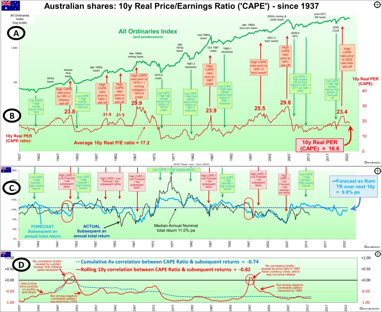
CAPE ratio chart for the Australian share market
Section A is the Australian broad share market price index ('All Ordinaries' and predecessors) at the end of each quarter since 1937 – for reference, showing the main booms and busts. (For Australia, we only have reliable profit data since 1937 – T. Mathews, RBA, 2019).
For long-term charts, we use a 'log scale' on the vertical axis to highlight the compound growth over time.
Like in the US market, in Australia, it has been more or less a straight line sloping upward, indicating a relatively consistent compound growth rate over time (apart from the usual booms and busts along the road), through all sorts of conditions, including world wars, cold wars, deep recessions, inflation, deflation, hyper-inflation, political turmoil, social and technological change, etc.
Section B shows the 'CAPE' ratio for the Australian market at the end of each calendar quarter.
This is the rolling 10-year average trailing four-quarter market aggregate EPS, adjusted for CPI inflation, divided by the real price index.
Booms and Busts
The CAPE ratio peaked at the tops of booms right before major busts:
- CAPE ratio of 30 at the end of 1968 during the late 1960s mining boom, before the 1970-1 mining collapse and 1973-4 property/finance crash.
- CAPE at 24 in September 1987 at the top of the mid-1980s takeover boom, right before the October 1987 crash.
- CAPE at 26 in late 2000 at the top of the 'dot-com' boom before the 'tech wreck.' Our 'dot-com' boom was much milder than in the US (where the US CAPE ratio reached an all-time US peak of 45), and therefore we also had a much milder 'tech-wreck' crash than in the US.
- CAPE at 30 in September 2007 at the top of the 2003-7 China/credit boom, right before the GFC sell-off. Just like in the late 1960s, our mining boom was much larger than in the US (which had a credit boom but not a mining boom as well), and therefore our crashes in the early 1970s and in the GFC were deeper than in the US market.
- CAPE above 23 at the end of 2021 at the top of the Covid stimulus tech boom before the 2022 rate hike sell-off. Just like in the late 1990s dot-com boom, our Covid stimulus boom was milder than in the US because we had fewer tech bubble stocks.
Conversely, the CAPE ratio reached lows (i.e., the market is cheap relative to trend real earnings) at the bottom of the busts.
Forecast Returns
Section C is where the action happens.
The light blue line in section C shows the forecast subsequent 10-year annualized total return from each point in time. This is calculated from the historical regression relationship between the CAPE ratio and subsequent returns from each point in time. This light blue forecast line oscillates around the median forecast of 11% per annum.
There is a clear pattern – when the CAPE ratio is high (the market is expensive relative to 10-year real earnings), forecast subsequent returns are below average, and when the CAPE ratio is low (the market is cheap relative to earnings), forecast subsequent returns are above average.
Current Forecast
To the right of the light blue forecast line, we highlight the current forecast for total returns (including dividends) from the market of around 10% per year over the next 10 years. This is more or less historical average returns, indicating fair pricing at present.
This is very different from the current forecast for the US market of a very low 4% per annum over the next 10 years. We cover this later.
With these types of models, there is always an allowance for forecasting errors. The 'forecast' number of 10% for the Australian market is not that important. What is important is that it is around average returns from the market overall. We return to this point later.
2022 Rate Hike Sell-off
At the end of December 2021, right before the 2021 rate hike sell-off, the Australian CAPE ratio was a very high 23.4, which is similar to September 1987, right before the October 1987 crash.
The high CAPE ratio at the end of 2021 indicated overpricing, but that was not the cause or trigger for the rate hike sell-off, of course. High pricing is not generally the cause or trigger for a fall, but it makes the market highly vulnerable and sensitive to negative shocks, whatever they may be. In that case, it was aggressive rate hikes to tackle high inflation.
Actual vs. Forecast Returns
The dark blue line in Section C is the actual subsequent 10-year average annualized total return from the market from each point in time.
This actual subsequent return line follows the same general pattern as the light blue forecast return line - both are above or below the median return line together. (There are two exceptions, highlighted)
The difference is that the actual returns line is more volatile and covers a wider range above and below the median than the light blue forecast return line. This is due to inevitable forecast errors when using past data and patterns to forecast the future. The patterns are never perfect, so the forecasts are only a rough guide.
Note the dark blue actual 10-year subsequent return line stops on the chart in 2013 because the subsequent 10-year return from 2013 brings us up to the present, in 2023.
Extremes Matter Most
This model works best at the extremes.
When the market is significantly overpriced, subsequent returns are highly likely to be significantly below average.
When the market is significantly underpriced, subsequent returns are highly likely to be significantly above average.
Strength of the Relationship is Remarkably Consistent
Section D shows the statistical correlation between CAPE ratios and subsequent returns.
Correlations have been strongly negative almost all of the time - i.e., high CAPE ratios are followed by poor subsequent returns, and low CAPE ratios are followed by above-average subsequent returns.
The blue dotted line is the overall cumulative correlation between CAPE and subsequent returns. This has remained strongly negative (between -0.5 and -0.7) for the past century.
The red line is the rolling 10-year correlation. This has been very strongly negative (between -0.8 and -0.95) almost all of the time.
You will rarely see a stronger correlation pattern over such a long period through all sorts of market conditions.
Exceptions to the Rule, But Only on Timing
As with the US market, there are rare exceptions to the rule in Australia, but the exceptions are different here because the US and Australian markets are different.
The only occasions the strong correlation between CAPE ratio and subsequent returns disappeared in Australia were both unusual episodes:
- In 1951-2 - caused by the sudden Korean War inflation spike recession, but the strong negative correlation pattern resumed quickly, from 1953.
- In 1997-8 – caused by price falls in the 1997 Asian currency crisis and 1998 Russian default/LTCM crisis, but the strong negative correlation pattern resumed quickly, from 1999.
These two anomalies illustrate the fact that these statistical models do not work like clockwork. This model has had very strong predictive power most of the time over many decades, but there are always going to be exceptions.
However, in both exceptions in Australia (as with both of the exceptions in the US market), the exceptions were short-lived, and the usual strong correlation patterns resumed the following year.
Wartime Controls
It should also be noted that wartime controls on company profits and share prices in Australia between 1942 and 1946 also distorted the usual relationship, although it was still a negative relationship as per the usual pattern.
(The wartime controls in Australia were to prevent profiteering and to suppress returns, in order to divert capital to the war effort instead of private investment. Australian profits and share prices would have been much higher had they not been suppressed by the wartime controls – but that's another story for another day!)
Not 'Timing' – It's About Knowing If You Are Buying Expensive or Cheap
As is the US, the CAPE model in Australia demonstrates that if you pay too much when you buy, you will almost certainly get poor returns from the high buy price, even if you don't buy in right at the top.
Conversely, if you buy cheaply (especially when buying a diverse range of stocks across the whole market index), you will almost certainly get above-average returns from the cheap buy price, even if you don't get the timing exactly right at the bottom.
Achieving below-average or above-average returns does NOT rely on perfectly timing the top or the bottom.
It just requires knowing whether you are buying 'expensive' or 'cheap'. This ratio is a reasonably good measure of fundamental pricing of the market.
What to Do with It
The Shiller/CAPE ratio is just one measure of fundamental pricing of the market. Investors should use a range of indicators to come up with their own view of the state of the market.
It is important to reiterate that this is just one measure, and it is a reasonably reliable indicator of likely long-term returns, but provides no guidance at all on the TIMING of a correction or rally, so it is not a timing indicator.
While an extremely high CAPE ratio should NOT be used as a trigger to sell or get out of the market, it can be seen as a red warning flag – especially to avoid ‘FOMO’ (fear of missing out), getting caught up in media frenzy over [insert fad-du-jure here], or chasing hot IPOs, or gearing up, or skimping on your normal research and analysis process.
Conversely, an extremely low CAPE ratio should NOT be used as a trigger to jump in and try to catch the bottom of a bust. Instead, it can be seen as evidence of cheap pricing, and avoid the temptation to capitulate and retreat from the market for many years.
I have met several investors who caved in and sold out at the bottom of the GFC, and are still in cash nearly fifteen years later, terrified of making another mistake.
It is easy to say: ‘Buy in the busts’ or ‘Buy when there’s blood in the streets!’ – but it is much more difficult for most people in the real world.
Managing Emotions
In all types of market conditions – especially at the tops of booms and the bottom of busts – the most important priority is managing your emotions - avoiding the temptation to be swept up in frenzied buying in booms, and equally frenzied selling in busts.
As always, there is no substitute for fact-based research and vigilance. Do not be rushed into action by frenzied media reports, or friends or family.
Where Are We Now?
The next chart plots the Australian CAPE ratio at the end of each calendar quarter (horizontal scale), against subsequent average 10-year returns from each point (vertical scale).
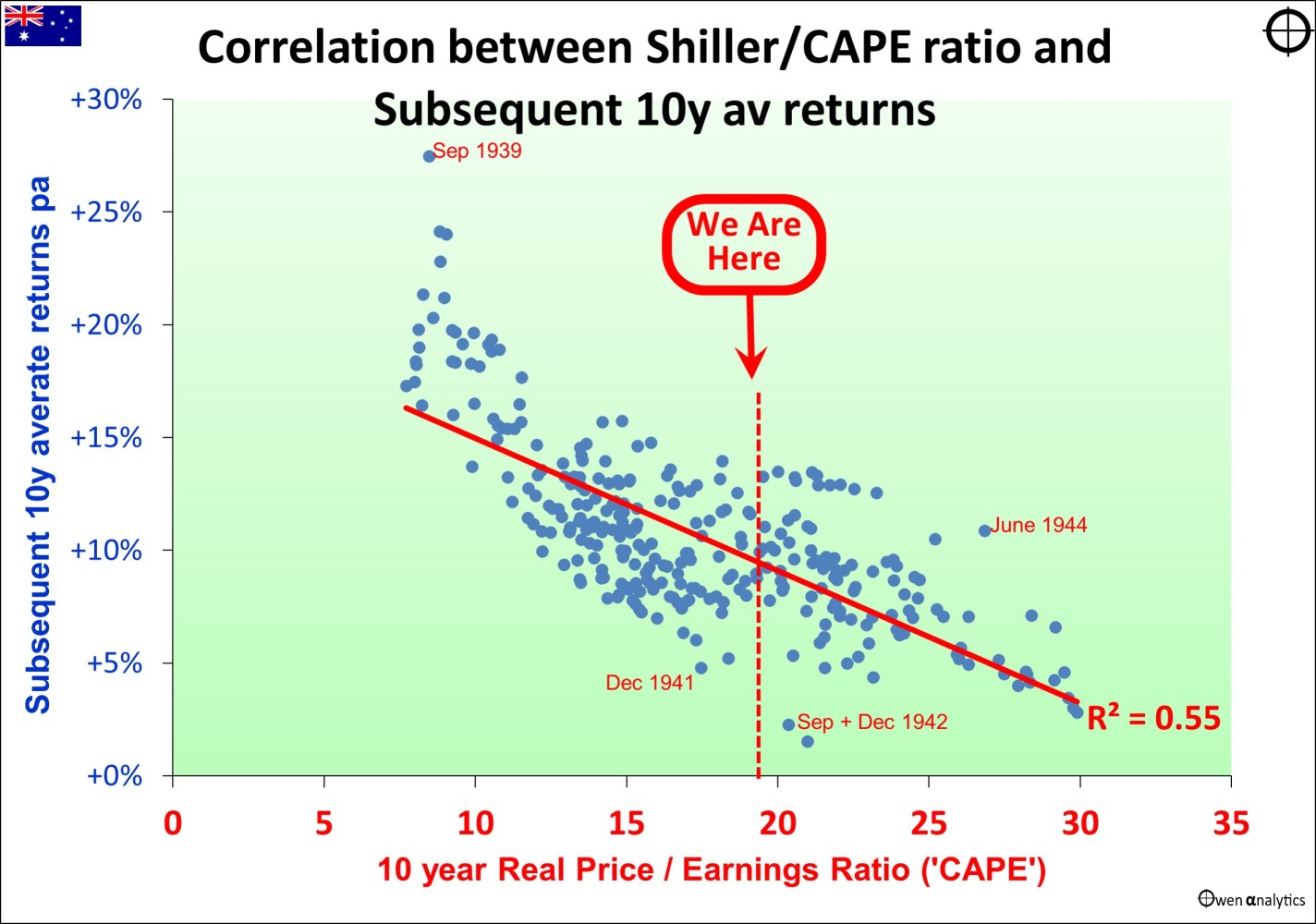
The downward sloping line indicates a strong pattern:
- In the lower-right section - when the CAPE ratio is high (market is expensive relative to real earnings trend), then subsequent returns over the next 10 years are low.
- In the upper-left section - when the CAPE ratio is low (market is cheap relative to real earnings trend), then subsequent returns over the next 10 years are high.
The main outliers (or exceptions to the pattern) are noted on the chart. These are related to the effects of wartime controls (covered below).
Where are we now?
The current CAPE ratio is around the middle of the horizontal scale (CAPE ratio a little above average), which points to the likelihood of around average returns over the next 10 years from the current level.
Different Signals from the US -v- Australia CAPE Models
The CAPE ratio for Australia is around average and forecasting around average returns from current levels, but the US market is still very expensive, and forecasting very low returns – see my last edition (‘US Market – ‘Shiller/CAPE’ ratio – flashing orange…’).
Here is the plot diagram of CAPE ratios versus subsequent 10-year average returns from the US market –
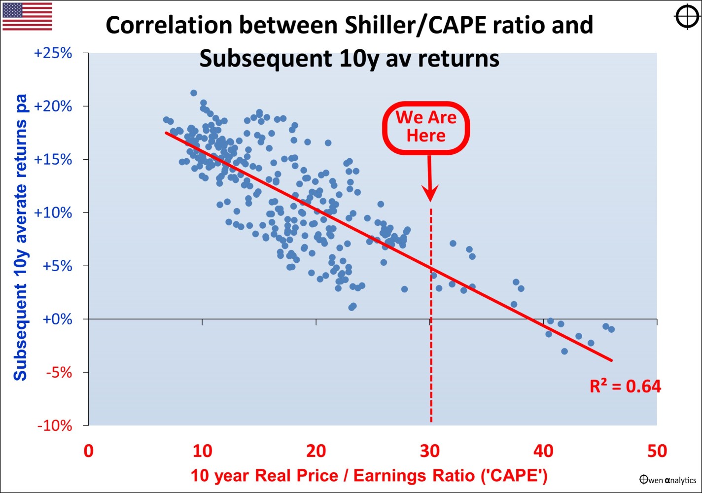
Currently, the CAPE ratio is much higher in the US than Australia, and forecast returns from CAPE are much lower in the US than Australia.
It would be tempting to say: ‘The Australia and the US have different companies, different economic cycles, and different politics, so what drives their share markets is different.
Therefore we should get out of (or significantly under-weight) the US market, but stay in the Australian market.’
However, this is not how the world works. Investment markets are driven by human emotions, not rational logic.
In reality what happens in the US dominates and drives global markets – shares, bonds, interest rates, inflation, currencies, commodities, and everything else. US euphoric booms become global euphoric booms, and US panics become global panics.
When the US market crashes, even if the reasons are purely domestic in nature, then Australia follows, regardless of local conditions and pricing. (The last time Australia did not follow a major US share market fall was the US ‘Panic of 1907’).
Direction is the Same, but Magnitude is Different
While Australia (almost) always follows US share market boom/bust cycles, the relative pricing of the two markets does make a difference to the magnitude of the busts.
After booms in which the US market is more excessively over-priced than the Australian market, the Australian crash is less severe. For example:
- the 2001-2 ‘tech-wreck’ after the late 1990s ‘dot-com’ boom when the US was more over-priced.
- the 2022 rate hike sell-off after the 2020-1 Covid stimulus tech boom, when the US was more over-priced.
Conversely, after booms in which the Australian market is more excessively over-priced than the US market, the Australian crash is deeper. For example:
- the early 1970s mining/property crash after the late 1960s mining boom, when Australia was more over-priced.
- the 1987 crash after the mid-1980s takeover boom, when Australia was more over-priced.
- the 2008-9 GFC after the 2003-7 boom when Australia was more over-priced.
Current Position and Outlooks
The US market is significantly over-priced on this very reliable CAPE ratio measure (real pricing relative to real trend earnings, but the Australian market is more or less fairly priced.
On this measure, it is highly likely that the US market will generate significantly below-average returns over the next decade. The poor US returns will probably be caused by a major correction of the current US tech/online/A.I. boom, but it will not necessarily happen immediately. There have been occasions in the past when the US market has run up much higher than the current level of over-pricing.
It could be a major correction lasting up to a year or two, or it might just be flat/choppy returns for many years.
During the likely poor returns from the US (whether a single crash or flat/choppy markets for years), it is highly likely that the Australian market will hold up better, just like in previous instances of busts where the US was more over-priced in the boom, so had further to fall in the bust.
A ‘Bottom-Up’ View
The CAPE measure is a ‘top-down’ model that just takes aggregate numbers for the whole market and ignores individual companies or sectors. We have seen that, on the CAPE ‘top-down’ basis, the Australian share market should out-perform the US in the next decade.
For a different perspective - let’s look very briefly at a ‘bottom-up’ approach, to see if it is consistent with the top-down view.
The local Australian market has three main segments:
- Miners - which just dig holes in the ground and ship raw materials to other countries to process them and make useful things out of them, which we re-import back at thousands of times the price we sold the raw materials for,
- Banks – the universally-hated, price-gouging, oligopoly dinosaur domestic banks, which just shuffle money around and take a clip on everything, every way they can, and
- The rest of the market is a mixed bag of mainly domestically focused companies, with virtually no global presence.
The US market, on the other hand, is home to household names that dominate the world – Apple, Microsoft, Google, Intel, Nvidia, Cisco, Adobe, Salesforce, Tesla, Amazon, Visa, Mastercard, Facebook, Netflix, Disney, McDonald’s, Nike, Coca-Cola, Pepsi, Starbucks, Johnson & Johnson, Pfizer, 3M, Boeing, and hundreds of other global companies.
Therein lies the problem for the US.
Being global in scope, the US giants are restricted by slowing global growth, aging populations, stagnating and soon falling global population, rising taxes, political and social unrest from rising inequality, global trade stalling, huge government debts, expensive energy transitions, and a host of other problems.
Some will still manage to grow of course, but it is highly unlikely that future growth will justify the current over-pricing.
Australia – Two Out of Three Ain’t Bad
On the other hand, the prospects for Australian companies are looking relatively good for two of the three segments:
- Miners – Australia is vast, and estimates of reserves for minerals are constantly being upgraded with new exploration and mining techniques and technologies.
- It’s just dumb luck – but it has made Australia the richest nation in the world per capita for the past 130 years, and it sure beats thinking, and actually making things!
- Australia will probably continue to develop into a giant ‘Swiss cheese’ of holes in the ground, with a lot more minerals than we ever thought existed, and many new types of stuff we don’t even know about now.
- As always, it will be a challenge avoiding the speculative bubbles and busts for every ‘hot’ mineral, but in aggregate the mining sector should have plenty of potential to grow, especially with increasing military build-ups.
Banks – the big banks probably peaked in the mid-2010s. There will be the odd tiny ‘disrupter’ here and there, but the current incumbents will continue to dominate, with growth stagnated by rising capital requirements, rising costs of compliance, fines, remediations, and still no incentive for innovation or competition.
The only thing going for the big domestic banks is rising local population (mainly via immigration) which will probably continue.
The rest –
- The track record of Aussie companies successfully and profitably cracking global markets has been extremely poor. For every success there have been hundreds of failures - but there is certainly no shortage of opportunity!
- Surely we can come up with another Macquarie or CSL in the next decade or so?
In later editions, I will outline several other ways to assess markets. No one model or approach is ‘best’. It is always useful to have a range of techniques that approach markets from different angles.
Stay tuned! Thank you for your time. Please send me feedback and/or ideas for future editions!