Key points:
-
-
- The 1987 crash was a prime example of how the most widely used measure of pricing for shares and share markets – the ‘price/earnings’ ratio - can give investors a completely false sense of security, and fail to warn of massive levels of hidden over-pricing.
- At the top of the market right before the 1987 crash, the Australian share market had a lower p/e ratio (ie was cheaper per dollar of earnings) than the US market, but our crash turned out to be much sharper and deeper than the US, and took five times as long to recover than the US (less than two years in the US, but more than eight years in Australia).
- The seemingly low p/e ratios for individual companies and for the overall market suggested relatively cheap pricing, but actually masked enormous underlying problems because much of the reported (and audited) ‘earnings’ were the result of financial trickery, related-party deals, fudged valuations, circular transactions, and straight-out fraud.
- Most people focus on the ‘p’ (price) but take the ‘e’ (earnings) for granted. The lesson is – ignore the price and focus instead on the alleged ‘earnings’.
- In the current ai / data centre / private credit boom – as in all prior booms - we are seeing increasing examples of tricky accounting, related-party deals, circular transactions, double-counting, fudged valuations, and straight-out fraud.
- Time to stop chasing the ‘p’, and focus attention on the ‘e’.
This is Part 1 of my thee-part series on the 1987 crash.
This week is the 38th anniversary of the October 1987 crash, and I remember it like it was yesterday. It was before the days of mobile phones or the internet, so I heard about the crash on the radio in a cab with the other three directors of our little investment firm, on the way in to the stock exchange. (We had floated four companies in the 1986-7 boom prior to the crash - but I cover that in Part 3 to be published shortly).
1987 Crash was much worse in Australia than the US
The October 1987 crash was Australia’s sharpest stock market crash by far, and the second deepest (only the 1929-31 crash was deeper). The All Ordinaries index fell by -50% in just 19 trading days, including the worst ever one-day fall of -25% on 20th October 1987, following a -20% fall on Wall Street overnight.
The Australian crash was much deeper than the US (-50% fall on the ASX compared to -34% for the S&P500 index). For the US it was a relatively minor hiccup - the S&P500 index recovered in less than two years. But in Australia the All Ords took eight and a half years to recover, and 17 years to recover in real terms after inflation. That’s a long time under-water.
But our Price/Earnings ratio was lower than the US!
The most widely used measure of pricing and valuation for shares and share markets is the ‘price/earnings’ ratio – which is the price divided by the most recent year’s earnings (profits), ie the price per dollar of earnings. The higher the p/e ratio, the more expensive it is per dollar of earnings.
I recently published a six-part series on share market pricing, including price/earnings ratios and how to interpret them. Here is a link to Part 1, which contains links to the other five parts in the series –
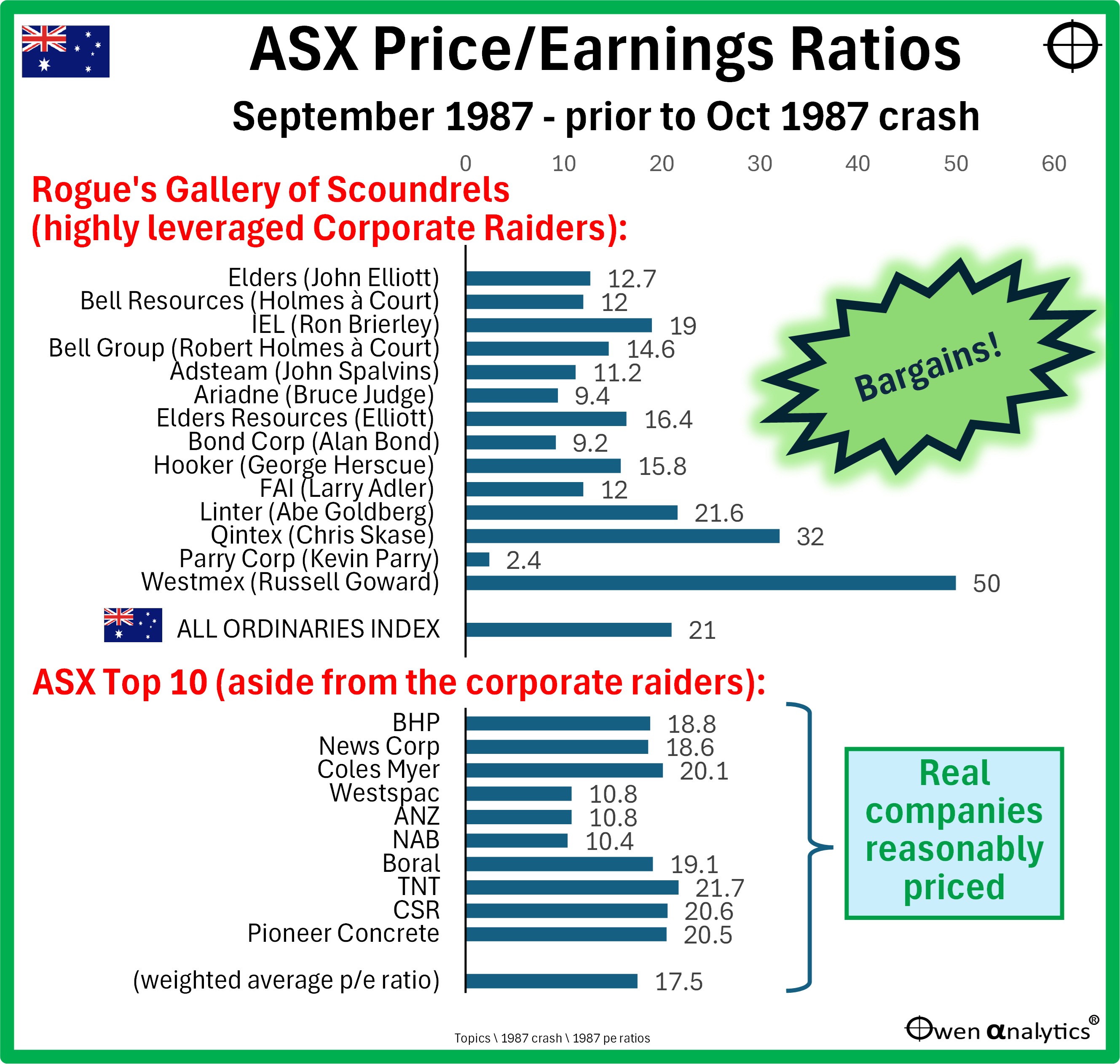
At the top of the crazy 1986-7 debt-fuelled take-over bubble right before the October 1987 crash, the Australian market was priced at 21 times aggregate earnings. This was lower (cheaper) than 22.3.times earnings for the US market (S&P500). Despite being cheaper than the US, the Australian market suffered a much deeper and longer crash than the US. Why didn’t price/earnings ratios provide any warning of the crash and the devastation to follow?
ASX price/earnings ratio were not overly high
At pre-crash p/e ratio for Australian market of 21 was higher than its historical average, but only because the market p/e ratio was being inflated by high p/e ratios for two of the big miners – Western Mining Corp (WMC) and CRA (WMC is now part of BHP after BHP acquired it in 2005, and CRA is now today’s Rio Tinto).
WMC and CRA were boring miners, not entrepreneurial bubble stocks, but they were trading on high p/e ratios of 49 and 57 respectively because of temporary, one-off company-specific circumstances.
Because of the heavy weightings of WMC and CRA in the overall index (they were the 3rd and 4th largest ASX stocks at the time), their high pricing distorted the p/e ratio for the overall market. If we exclude WMC and CRA, the market p/e ratio was below 20, which is more or less in ‘fair value’ territory for the ASX.
Certainly no warning of the catastrophic -50% crash that took nine years to recover!
Low Price/Earnings ratios for the bubble stocks!
On the other hand, at the top of the boom right before the crash, almost all of the aggressive corporate raiders were trading on low p/e ratios, suggesting they were downright cheap relative to their ‘earnings’.
Today’s chart shows price/earnings ratios for the market and for various companies in September 1987 just before the October 1987 crash. The upper section shows the main bubble stocks the highly leveraged ‘corporate raiders’.
Almost all of them had very low p/e ratios, which made them look like downright bargains! Why not gear up and buy more!
Many readers will remember quite a few names on that list of scoundrels that ended up as record-breaking corporate losses, bankruptcies, criminal convictions, jail time, and fugitives on the run. Ah, the memories!
These seemingly low p/e ratios based on published profit reports turned out to be meaningless because the ‘earnings’ side of the equations were grossly inflated by widespread accounting trickery, fudged valuations, related-party deals, circular transactions, and often just straight-out fraud – all signed off by tame, conflicted auditors.
The lesson - Never, ever, EVER, take audited accounts at face value! And therefore, you can never trust price/earnings ratios based on those audited accounts.
‘Real companies’
The lower section of the chart shows the p/e ratios of the ten largest real companies on the ASX excluding the corporate raiders (and excluding WMC and CRA as explained above). These real companies with real profits and real dividends were trading on reasonable multiples of earnings.
The weighted average p/e ratio for these ten largest real companies was just 17.5. This suggested around ‘fair’ pricing, as it was pretty much the historical average market p/e ratio.
What went wrong?
The crazy mid-1980s boom was fuelled by an orgy of ultra-loose lending from the big banks following bank deregulation (with the notable exception of NAB, which sensibly refused to go to the party).
Westpac had a near-death experience when bad debts from bad lending wiped out more than half of its equity capital, and it had to be rescued by LendLease/MLC (yes, you read that correctly. How times change!). ANZ also came close to a near-death experience from its enormous bad debts from bad lending to entrepreneurs and commercial property developers.
To this day, neither Westpac nor ANZ have fully recovered from the scars of the early 1990s banking crisis as a result of the 1980s lending binge. For my analysis of the big Aussie banks since 1980, see -
Even the boring old State-owned Banks went mad in the wild 1980s lending spree. The State Banks of Victoria and South Australia were the worst offenders. In the wake of the mountains of bad debts from bad lending in the 1980s lending binge, the State banks of every State were closed down, broken up, and/or sold off (except Queensland which, wisely, did not have a State Bank.) State taxpayers were still paying for the losses decades later.
Lessons for today’s boom?
The current global boom will end in big price falls and even bankruptcies for many of the highly fancied stocks, and they will drag the rest of the market down with them, including companies that have nothing to do with the bubble sectors – just like in every prior boom/bust cycle. The only question is when.
Also, as in most speculative booms, we are seeing increasingly frequent examples of accounting trickery, fudged valuations, related-party deals, circular transactions, and straight-out fraud. Not just in the ai/tech sector but also in related industries, including ai data centres, and private credit, which is increasingly funding these sectors.
Sure, companies are posting profits – but are they real and sustainable? When the day of reckoning arrives (and we don’t know when that will be), actual sustainable profits are probably only a fraction of what is being reported in many cases.
(It was the same in the late 1990s ‘dot-com’ boom before the 2000-2 ‘tech-wreck’, and again in the 2003-7 credit derivatives boom prior to the 2008-9 ‘global financial crisis’.)
The 1987 crash is a good reminder to not take published/audited profits for granted, and the p/e ratios on which they are based. Time to stop chasing the ‘p’, and focus attention on the ‘e’.
Look out for follow-up stories on the 1987 crash:
'till next time . . . safe investing!