Here’s my three-quarter time report card for the main asset classes/segments and typical diversified portfolio returns for 2025 (to end of September). It’s turning out to be another great year for lazy, passive, diversified investors.
Key points:
-
-
- Despite all the dramas of Trump’s tariffs, rising political unrest across the world, on-going wars, mounting deficits and debts everywhere, the ‘cost of living’ crisis, and endless tiresome predictions of imminent recessions and/or crashes, 2025 is shaping up to be one of the better years for diversified investors – for returns, and also for the consistency of positive returns across asset classes.
- Similar to 2004, 2005, 2006, 2012, 2016, 2017, 2019, and 2023, when just about everything was positive.
- So far in 2025, most ‘risk’ or ‘growth’ asset classes are posting good positive returns, beating inflation, and ahead of their long term averages.
- Most of the traditional ‘defensive’ asset classes (mainly fixed and floating rate debt) are also posting positive returns, beating inflation but by smaller margins, and are generally below their long term averages – due to inflationary fears, which is fairly typical in the middle-late stages of booms.
- Investors in a typical ‘70/30’ diversified portfolio are heading for another great year of double-digit returns.
- Today’s chart of returns from 26 asset classes and segments each year since 2000 appears like a randomly scattered patchwork with different winners and losers each year, but it shows that most things do pretty well in most years.
- It also highlights the years when things go very wrong – like 2002, 2008, 2011, 2018, and 2022. But it also shows that returns almost always rebound strongly the following year.
- It is one of my go-to charts illustrating the value of diversification and patience, rather than piling into last year’s winners, and/or trying to chase the latest hot themes / stocks / funds / fads.
- The far right column shows my up-dated league table of overall average long-term returns. Which are the big movers this year?
Today’s chart shows total returns (ie including income but before management fees) from 26 investment asset classes (and sub-classes) per calendar year since the start of this century. Asset class returns per year are ranked from best (top) to worst (bottom) - returns above the red line are positive, below are negative.

This is designed primarily for Australian investors, so returns from international asset classes come in two flavours – marked ‘U’ for un-hedged AUD, and ‘H’ for hedged AUD where available.
It is one of my go-to charts to help illustrate the value of diversification and patience, rather than piling into last year’s winners, and/or trying to chase the latest hot themes / stocks / funds / fads.
I use these asset classes and segments as the basic building blocks in my portfolios over the past 20 years (for advice firms and for my own money). Each can be accessed by low-cost ETFs, which I actually use in portfolios, so this is not just an academic exercise.
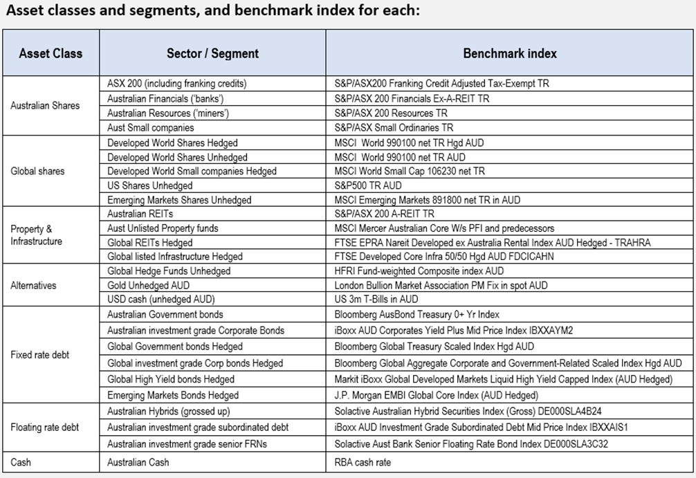
I have included a table of benchmarks for each asset class / segment at the end of this article.
Portfolio returns and Inflation
Below the main table are returns from a typical simple ‘70/30’ portfolio consisting of:
-
-
- 35% Australian shares,
- 35% developed market shares (50% of which is FX hedged),
- 15% Australian bonds (split 50/50 government/corporate),
- 15% hedged global bonds (also split 50/50 government/corporate),
- with all holdings rebalanced yearly. More on this below.
This is almost exactly what ‘big super’ funds end up with in their ‘default’ funds (aside from all of their ‘private market’ assets with their opaque accounts and fudged valuations).
The big super funds have floors full of expensive analysts and portfolio managers, and they spend money on expensive directors and trustees, wasteful marketing, and secret payments siphoned off to pay union bosses and political donations.
You and I can achieve the same asset allocation - with mostly better results, lower costs, and much greater transparency - with a handful of low-cost ETFs – as I have done for advice firms for the past two decades.
For my own actual long-term ETF portfolio, which is beating the industry funds, see –
All returns on the chart table are before fees, so you can deduct a fraction of a percent from returns, as all of these asset classes are available in the form of very low cost ETFs. (Fees on passive ETFs range from around 0.05% for share ETFs, and from around 0.10% for bond ETFs).
Inflation
The bottom section of the chart shows Australian CPI inflation per year. Here we can see how the inflation spike in 2022 hurt returns from most asset classes – especially fixed rate debt (bonds) which suffered their worst returns in a century.
2025 score card – to end of September
So far this year, 25 out of the 26 asset classes/segments are positive (above the red line), and 24 out of 26 are beating inflation.
The only asset class not positive this year is US dollars held in Aussie dollars – because the Aussie dollar has risen against the US dollar. US dollars are a very effective ‘safe haven’ asset for Aussie investors to hold in a broad global sell-off (because the AUD always falls against the USD in broad sell-offs, so US cash does well in Aussie dollars). I used it successfully in client portfolios in the 2011 and 2018 sell-offs, so it is a temporary tactical holding to be used in certain circumstances, not a standard long-term holding in portfolios.
Aside from US dollar cash, the only asset class not beating inflation this year is global government bonds (hedged). This is a fairly standard long-term holding in most, if not all, big super/retirement funds in Australia and around the world. Investment grade bonds in general (government, corporate, semi-gov) are having a very poor run since inflation returned in 2021.
I have been out of fixed rate bonds entirely in advised portfolios (and my own) since 2021 because I feared that rising inflation would hurt bond returns. It did. Big time. I am quite happy to stay out of fixed rate bonds in the current environment.
What about ‘private assets’?
Note that I do not include so-called ‘private assets’ (like private equity, venture capital, private credit) in the table of standard investment types. There are some good funds run by good people, but their funds are either closed years ago, or they tend to have high entry levels (eg US$10 million), ‘capital calls’ (commitments for additional contributions in the first few years), and lengthy lock-up periods (7 to 10 years).
In the past few years, after big problems hit private capital markets (ridiculous prices paid for dud businesses in the Covid stimulus boom, and huge debt loads taken on when interest rates were near zero; the IPO market drying up; and the trade-sale market closing due to lending crackdowns and rising interest rates), fund promoters have rushed to cobble together complex structured products aimed at the cashed-up ‘retail’ market.
Most of these retail ‘private market’ structures are riddled with a host of problems including: extra layers of fees, fudged internal valuations, highly concentrated exposures, propensity to chase the latest hot fads, hidden layers of leverage, derivatives, counter-party risks, related-party transactions, opaque accounting, scant/fudged reporting, fudged/selective returns. The engineered ‘liquidity’ and ‘accessibility’ in these retail structures is mostly illusory and will disappear when the bust comes. There is always a bust!
Some of the underlying wholesale funds may be worth a punt if using ‘play-money’ you can afford to lose, but not for serious long-term portfolios that you and your family are going to be relying on for future wealth and lifestyles.
(Trust me on this. I have spent many thousands of hours over the past 20 years in hundreds of meetings with fund managers and doing due diligence research on funds from Australia and around the world. By the time you do enough research to satisfy yourself that you, and they, actually know what is going on in there – the fund will have disappeared, or run into trouble. Plus I have lived through every boom and bust since the early 1980s!)
I know that many advisers have clients who are always chasing what I call ‘shiny new toys’. (“Any 10 year-old can buy ETFs – I want something special and exciting! I want to find the next Google / Nvidia / OpenAI / [insert latest fad here] !”)
If they insist on chasing the illusion with ‘shiny new toys’ - get them to sign wavers (confirming that it was their idea, not yours) and make sure it is just play-money they are risking.
Asset class returns since 2000
The overall table of returns looks like a random patchwork quilt with no apparent rhyme or reason. There different winners and losers each year, with returns from each type of asset jumping around from year to year.
Some quick observations:
-
-
- In most years, most asset classes post positive returns, and ahead of inflation.
- There are occasional years when everything is positive – like 2005, 2016, and 2019.
- But the rest of the time there are some that post negative returns.
- In the big bust years (like 2008 and 2022), most types of assets post negative returns.
- But even in the worst years, several asset types still manage to post positive returns, although the winners are different each time.
Most frequent highest returning assets
The asset classes with the most years with the highest returns are:
-
-
- Australian miners = 5 years (2001, 2005, 2007, 2016, 2022 - China boom, then China stimulus)
- US shares (Unhedged) = 4 years (2013, 2019, 2021, 2023 in the tech boom)
- Gold (unhedged AUD) = 3 (2008 in the GFC and then 2024 & 2025 so far)
- Australian REITS = 3 years (2004, then 2012 and 2014 in the QE boom)
- Global REITS (hedged) = 2 (2006, 2014 in the QE boom)
- Developed world small companies (hedged) = 2 (2003, 2010) – but the overall winner
- Developed world shares (hedged) = only 1 year (2020 in the Covid lockdown sell-off)
- Australian banks = 1 year (soaring in the 2000 in the tech wreck)
- Australian small companies = 1 (2009, soaring back in the GFC rebound)
- Emerging Markets shares (unhedged) = 1 (2017 in the China stimulus re-boot)
- Emerging Markets bonds (hedged) = 1 (2002, in the worst of the US-led tech wreck)
- Australian government bonds = 1 year (2011 in the US downgrade / sovereign debt crisis)
- USD cash (unhedged) = 1 – yes holding US dollar cash was best returning asset in 2018 when a rapid succession of Fed rate hikes caused a sell-off on US recession fears, and the Aussie dollar fell heavily, leaving US cash holders with the ultimate ‘safe haven’ asset that year. Clients of my firm at the time (Stanford Brown) will recall that I added USD cash and unhedged Gold into all discretionary portfolios in 2018 before the sell-off and they turned out to be the best asset classes in portfolios for the year.)
It is notable that the best overall asset class over the whole period - Developed world small company shares (hedged) was the best asset in only two years (2003, 2010 – both rebound years). The key is that returns have been consistently reasonably good in almost all years.
Likewise, Australian banks ranked third best over the whole period, but were only the best asset class in one year (2000). This is a testament to their relative consistency, despite the GFC.
Conversely, the more volatile Australian mining shares were the best asset classes in the most number of years (five), but ranked only 5th overall over the whole period, due to their greater variation of returns each year.
Most frequent lowest returning assets
Asset types with the most years with the lowest returns have been:
-
-
- USD cash (unhedged AUD) = 9 years as the lowest returning asset type – a ‘safe haven’ but understandably poor returns
- Global REITS (hedged) = 3 years (2007, 2020, 2022 in Covid lockdowns & Covid inflation spike)
- Australian miners = 3 years (2011, 2015, 2024)
- Australian unlisted property trusts = 2 (2023 and 2024)
- Gold (unhedged) = 1 (2013)
- Emerging Markets shares (unhedged) = 1 (2000)
- Developed Markets shares (hedged) = 1 (2002 tech wreck)
- US shares (unhedged) = 1 (2002 tech wreck)
- Australian REITS = 1 ( 2008 GFC)
- Global Hi Yield bonds (hedged) = 1 (2005, but still decent returns)
- Developed world small companies (hedged) = 1 (2001 tech wreck)
- Australian government bonds = 1 (2021)
- Australian cash = 1 (2019)
Average returns since 2000
The far right column shows average annualised returns over the period since the start of 2000.
So far this century:
-
-
- every type of asset has generated positive total returns (above the red line)
- everything except USD cash (in the hands of un-hedged Aussie investors) has beaten inflation
- 1st place with highest average total returns = Developed world small companies (hedged) with an average return of 10.6% pa
- 2nd = Gold in unhedged Australian dollars – with 10.6% pa - gained 3 places this year
- 3rd = Australian banks (overtook Australian miners in 2024) with 10.4%.
- 4th = Australian shares (ASX200 including franking credits) with 10% pa.
- 5th = Australian miners (were coming 2nd until 2024) with 9.6% pa.
US and global share markets are well down this overall league table since the start of 2000 as they suffered badly in the 2000-2 ‘tech wreck’. However, we can see that US shares have been at or near the top of the table in recent years, but they will fall again when the current US-led global tech boom collapses (always have, always will – next time will be no different!)
Portfolio construction
Good portfolio construction is not about trying to pick the ‘best’ asset class(es) each year or trying to avoid the ‘worst’. Nor is it about chasing last year's winners (hoping for a ‘momentum’ effect), or last year's losers (hoping for a ‘contrarian’ or ‘reversion’ effect). These strategies almost always destroy wealth.
Good portfolio construction is about selecting the most appropriate mix of assets so that the overall portfolio has the greatest probability of achieving each investor’s long-term goals, within their tolerance for risk and volatility (ups and downs along the way), and their liquidity requirements.
Sample portfolio returns
On our simple ‘70/30’ portfolio, the returns are before fees, and they assume no ‘alpha’, and no asset allocation changes, just setting the initial ‘strategic’ asset allocation and then re-balancing back to this mix each year.
Key outcomes for the pro-forma 70/30 portfolio:
-
-
- Overall average returns of 8.8% pa this century (before fees). That’s actually not bad considering the first three years were the ‘tech-wreck’ following the 1990s ‘dot-com’ boom.
- With inflation averaging 2.9% pa, this simple 70/30 portfolio would have returned well above CPI+5% pa (even after allowing for ETF fees), which is a typical target return for long-term ‘growth’ portfolios.
- There have been five years of negative portfolio returns this century (2002, 2008, 2011,2018, and 2022), but four out of five of these were followed by very strong rebound years.
The consistency of these pro-forma portfolio returns over so many years illustrates the power of passive diversification - not trying to pick winning asset classes all the time, and not trying to pick ‘hot’ active funds within each sector.
I will report on full year returns for 2025 at the start of January 2026.
Will the current boom last?
We're in a boom of course, which is starting to display more than a few characteristics of a bubble. The bad news is that it will end one day - just as prior booms did. We can see the 'tech wreck' and the GFC sell-offs, and how they affected different asset classes in today's chart.
The good news is that over-priced booms can last for many years before finally crashing. The 1920s was virtually a decade-long boom before it finally ended in the 1929 crash. The 1990s was also a decade-long boom before it finally ended in the tech-wreck.
The other good news is that asset classes almost always rebound reasonably quickly after big negative years - also illustrated in the chart. Not always of course - every bust is different in its own way.
Thank you for your time!
‘till next time . . . . safe investing!
See also –
For my most recent monthly update on local & global markets for Aussie investors:
For my own long-term ETF portfolio - see: