The 'Cyclically Adjusted Price/Earnings Ratio' ('CAPE') is probably the most widely used measure of fundamental pricing or value of share markets.
As the US share market dominates global markets and US events echo around the world, the starting point for forming a view of portfolio impacts is the US.
This ratio has a long track record of measuring fundamental pricing and value and pointing to future returns.
More about the ratio and how it works in a moment.
But first - Where are we now?
Before we get into the mechanics, let's cut to the chase – where are we now? and what does it mean?
As at the end of September 2023, the current 'CAPE' ratio for the US market is a rather high (expensive) 29.4. This is nearly twice the long-term average CAPE ratio of around 16.
But it is not as high as the extremely high 40 at the end of December 2001, which was right before the start of the 2022 sell-off.
Over-priced – pointing to very poor returns
The current high CAPE ratio is a sign that the US share market is significantly over-priced, and that subsequent returns over the next 10 years from this point are highly likely to be significantly below average.
However, a high CAPE ratio is NOT a warning of an imminent correction. This is a long-term model, so it provides NO guidance on short-term or medium-term returns along the path to the 10-year forecast return.
It just says that average returns over the next ten years are probably going to be well below average from the current starting point.
All we can observe is that the more extreme the level of over-pricing, the more likely the correction is to occur sooner rather than later. (Like all models, there are exceptions, and we look at these a little later.)
Cyclically Adjusted Price/Earnings Ratio ('CAPE') for the US
This measure was pioneered in the 1930s and 1940s by Ben Graham (Columbia University professor and Warren Buffett's professor, and also his first boss and mentor). It was popularized by Robert Shiller (Yale professor and 2013 Nobel Prize co-winner) in the 1980s. Shiller provides regular data updates here.
It is based on the notion that in the traditional 'p/e' (price/earnings') ratio, the 'e' is just the most recent aggregate earnings (profits), which can be distorted by a range of factors including economic cycles, tax changes, and one-off events.
The 'cyclically adjusted ratio' uses a long-term rolling averages (usually 7 or 10 years) of real earnings, in order to smooth out cyclical volatility, and also adjusts for inflation.
It is sometimes known as the 'Shiller' ratio, or the 'Graham and Dodd' ratio (after their book: 'Security Analysis', first published in 1934 and is still to this day the bible of investment analysis).
The ratio has proven to be a relatively reliable predictor of future returns over long holding periods (e.g., at least 7 years) for several decades through a variety of economic and market conditions.
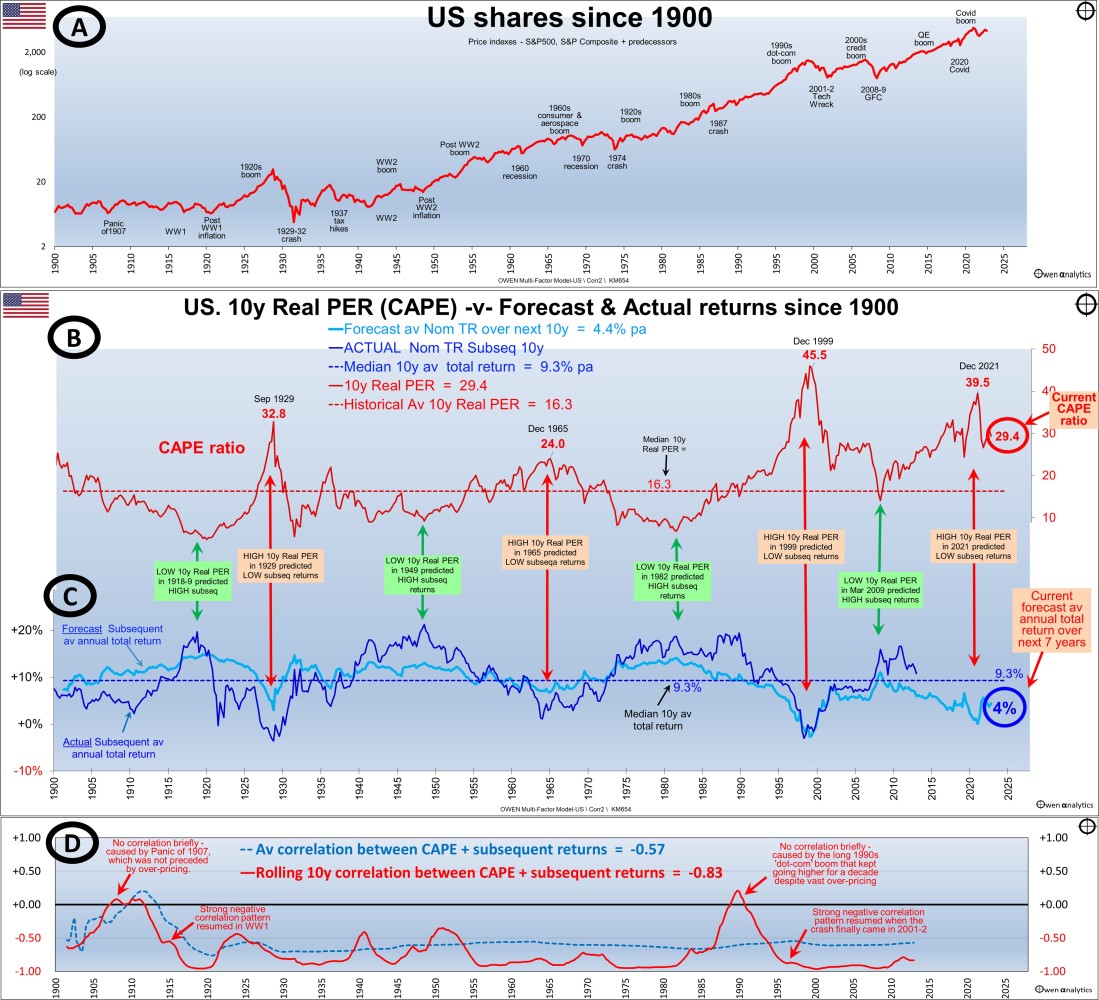
CAPE ratio charts for US share market since 1900
How it works
There are four sections in the charts.
Section A is the quarterly US price index (S&P 500 and predecessors) – for reference, showing the main booms and busts since 1900. I use a 'log scale' for long-term price or returns charts to highlight the compound growth over time.
Over the past century, it has been more or less a straight line sloping upward, indicating a relatively consistent compound growth rate over the century (apart from the usual booms and busts along the road).
The US market has delivered relatively stable returns over the past century, through all sorts of conditions, including world wars, cold wars, deep recession, inflation, deflation, hyper-inflation, political turmoil, social and technological change, etc.
Section B shows the 'CAPE' ratio for the US market at each point in time.
This is the rolling 10-year average trailing four-quarter market aggregate EPS, adjusted for CPI inflation, divided by the real price index.
The CAPE ratio peaked at the tops of booms:
- CAPE ratio of 33 in September 1929 at the top of the 1920s boom, right before the 1929-1932 crash.
- An all-time high CAPE above 45 at the end of 1999 at the top of the 'dot-com' boom before the 'tech wreck'.
- Above 39 at the end of 2021 at the top of the Covid stimulus tech boom before the 2022 rate hike sell-off.
Notice how the US CAPE was not excessively high in late 2007 at the top of the credit boom before the GFC, unlike the Australian market. The local Australian market was more over-priced than the US - we had the China/mining boom as well as a credit boom – so the Australian market had a bigger boom, and then promptly fell further than the US market in the 2008-9 GFC.
Forecast returns
Section C is where the action happens (yes, there is action!)
The light blue line in section C shows the forecast subsequent 10-year annualized total return from each point in time. This is calculated from the historical regression relationship between the CAPE ratio and subsequent returns from each point in time. This light blue forecast line oscillates around the median forecast of 9.3% pa.
There is a clear pattern – when the CAPE ratio is high (the market is expensive relative to 10-year real earnings), forecast subsequent returns are below average, and when the CAPE ratio is low (the market is cheap relative to earnings), forecast subsequent returns are above average.
Current forecast
To the right of the light blue forecast line, we highlight the current forecast for total returns (including dividends) from the market of just 4% per year over the next 10 years. That’s a very bearish long-term forecast!
With these types of models, there is always an allowance for forecasting errors. The actual number of 4% is not that important. What is important is that it is well below average returns from the market overall. We return to this point later.
Covid lockdown sell-off
At the end of December 2019, right before the 2020 Covid lockdown share sell-off (Feb-March 2020), the US CAPE ratio was a very high 31, which is only a fraction higher than it is now.
The pre-Covid CAPE was similar to September 1929 immediately before the 1929-32 crash.
The high pre-Covid CAPE ratio indicated over-pricing, but that was not the cause or trigger for the Covid-sell-off, of course.
The market rebounded quickly in 2020 and was very soon into the extraordinary 2020-1 Covid stimulus tech/online/A.I. boom, thanks to the free stimulus money sprayed around everywhere by governments and central banks.
That 2020-1 boom reached a peak CAPE of nearly 40 at the end of December 2021, so it was poised for a major correction. That was the second-highest CAPE ratio behind the 'dot-com' boom peak at the end of 1999, and we know what happened after that.
The inflation factor?
Keen readers will observe that the US CAPE ratio has been above 20 for 20 years now (apart from a brief dip in the 2008-9 GFC). The CAPE ratio has never been elevated for that length of time in history, and it is unlikely to be sustained at elevated for much longer. The tech boom may well run on for a lot longer, but when it ends it will have further to fall.
The traditional response to persistently high CAPE ratios has been: 'Ah yes, but lower inflation and interest rates should support higher share prices!' That may have been the case in the low-inflation era, but that era is well and truly over.
Actual -v- returns
The dark blue line in Section C is the actual subsequent 10-year average annualized total return from the market from each point in time.
This subsequent return line follows the same general pattern as the light blue forecast return line - both are above or below the median return line together.
The difference is that the actual returns line is more volatile and covers a wider range above and below the median, than the light blue forecast return line. This is due to inevitable forecast errors when using past data and patterns to forecast the future. The patterns are never perfect, so the forecasts are only a rough guide.
Note the dark blue actual 10-year subsequent return line stops on the chart in 2013 because the subsequent 10-year return from 2013 brings us up to the present, in 2023.
Extremes matter most
This model works best at the extremes.
When the market is significantly over-priced, subsequent returns are highly likely to be significantly below average.
When the market is significantly under-priced, subsequent returns are highly likely to be significantly above average.
Strength of the relationship is remarkably consistent
Section D shows the statistical correlation between CAPE ratios and subsequent returns.
Correlations have been strongly negative almost all of the time – i.e., high CAPE ratios are followed by poor subsequent returns, and low CAPE ratios are followed by above-average subsequent returns.
The blue dotted line is the overall cumulative correlation between CAPE and subsequent returns. This has remained strongly negative (between -0.5 and -0.7) for the past century.
The red line is the rolling 10-year correlation. This has been very strongly negative (between -0.8 and -0.95) almost all of the time.
You will rarely see a stronger correlation pattern over such a long period through all sorts of market conditions.
Rare exceptions to the rule, but only on timing
The only occasions the correlations disappeared (i.e., when there was no relationship between the CAPE ratio and subsequent returns) were both unusual episodes:
- The Panic of 1907, where low pricing at the bottom of the sell-off in late 1907 was not followed by above-average returns because the end of the subsequent 10-year period happened to coincide with the market falling at the end of the First World War. The strong negative correlation pattern was restored quickly.
- In 1990 the negative correlation broke down because the long 1990s 'dot-com' boom kept going higher for a decade despite vast over-pricing. However, the strong negative correlation pattern resumed quickly when the crash finally came in the 2001-2 'tech-wreck,' which was deeper and longer than every other crash except 1929-32.
These two anomalies illustrate the point that these statistical models do not work like clockwork. This model has had very strong predictive power for more than a century, but there are always going to be exceptions.
However, in both of these exceptions, it is not as if the model did not work; it was just that the timing was off by a year. Anybody who 'bought the market' any time in the late 1990s boom suffered lower than average returns for the next two decades.
Not 'timing' – it's about knowing if you are buying expensive or cheap
So the model still proves the point – if you pay too much when you buy, you will almost certainly get poor returns from the high buy price, even if you don't buy in right at the top.
Conversely, if you buy cheaply (especially when buying a diverse range of stocks across the whole market index like the S&P), you will almost certainly get above-average returns from the cheap buy price, even if you don't get the timing exactly right at the bottom.
Achieving below-average or above-average returns does NOT rely on perfectly timing the top or the bottom.
It just requires knowing whether you are buying 'expensive' or 'cheap.' This ratio is a reasonably good measure of the fundamental pricing of the market.
What to do with it
The Shiller/CAPE ratio is just one measure of the fundamental pricing of the market. Investors should use a range of indicators to come up with their view of the state of the market.
It is important to reiterate that this is just one measure, and it is a reasonably reliable indicator of likely long-term returns but provides no guidance at all on the TIMING of a correction or rally, so it is not a timing indicator.
While an extremely high CAPE ratio should not be used as a trigger to sell or get out of the market, it can be seen as a red warning flag – especially to avoid ‘FOMO’ (fear of missing out), getting caught up in media frenzy over [insert fad-du-jure here], or chasing hot IPOs, or gearing up, or skimping on your normal research and analysis process.
Conversely, an extremely low CAPE ratio should not be used as a trigger to jump in and try to catch the bottom of a bust. Instead, it can be seen as evidence of cheap pricing, and avoid the temptation to capitulate and retreat from the market for many years.
I have met several investors who caved in and sold out at the bottom of the GFC, and are still in cash nearly fifteen years later, terrified of making another mistake.
It is easy to say: “Buy in a bust – buy when there’s blood in the streets!” – but it is much more difficult for most people in the real world.
Managing emotions
In all types of market conditions – especially at the tops of booms and the bottom of busts – the most important priority is managing your emotions - avoiding the temptation to be swept up in frenzied buying in booms, and equally frenzied selling in busts.
As always, there is no substitute for fact-based research and vigilance.
Australia next!
In the next edition, I will do the same for the Australian share market. Here it is -
Although most readers are in Australia with large allocations to Australian shares, I usually start with the US market because that dominates world markets. What happens in the US drives all global markets, regardless of local conditions and pricing.
Then in later editions, I will outline several other ways to assess markets.
Stay tuned!
Thank you for your time. Please send me feedback and/or ideas for future editions!