By popular demand, following my recent ‘annual return pyramids’ for the Australian share market, here are the equivalent annual Nominal and Real return pyramids for the US market.
Key points:
-
-
- 2025 was another very good year of well above average nominal and real returns from the US market.
- Five out of the past six years have been well above average for the US market – higher than Australia.
- Over the long term, the US market has posted LOWER overall average Nominal returns than Australia, but HIGHER average Real returns, because inflation has been higher in Australia than the US.
- US real return pyramid is much ‘lumpier’ than Australia because of higher volatility in the US market.
- The US market is currently ahead of Australia, but that will reverse when (not if) the current tech boom ends.
As with the Australian return pyramids, each box represents a calendar year since 1900, with the years organised into 5% return bands based on total returns (ie capital gains plus dividends) from the broad US share market. The worst years are at the left, through to the best years to the right.
First, below is the annual Nominal return pyramid for the US market. Compare this to the equivalent Nominal return pyramid for Australia here.
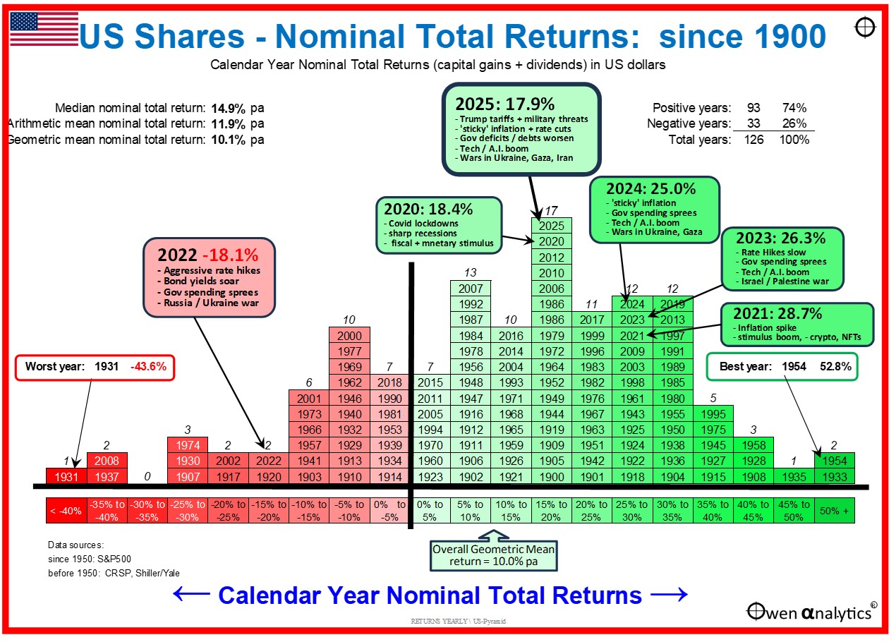
Main features of the Nominal total return pyramid for the US market:
-
-
- 2025 was another very good year of above average returns.
- I have highlighted the well above average returns in five out of the past six years, with only 2022 being negative (shares hit by aggressive rate hikes by the Fed to belatedly attack inflation).
- Overall since 1900, positive returns in 75% of all years for the US market (lower than the 79% positive years for Australia).
- Overall geometric (compound) average Nominal returns were 10.1% pa for the US (also slightly less than 10.4% pa for Australia).
- However, Australia has had higher inflation so the US beats Australia on a real return basis (see below).
- The overall shape of the US pyramid is similar to the Australian pyramid, with similar best years and worst years at the extreme ends.
Next is the US pyramid of annual Real returns (after US inflation). Compare it to the equivalent Real return pyramid for Australia here.
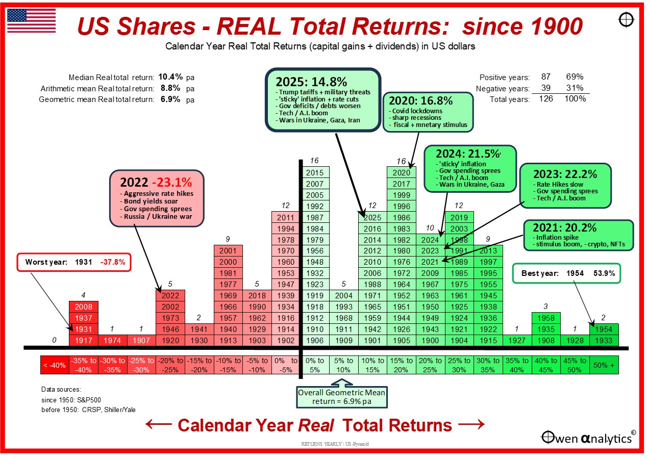
Main features of the Real total return pyramid for the US market:
-
-
- Overall since 1900, positive real returns (ie ahead of inflation) in 69% of all years (less than 72% positive real return years for Australia).
- Overall geometric (compound) average real returns were 6.9% above inflation for the US market.
- This is slightly ahead of Australia’s average CPI+6.5% per year, because Australia has had higher inflation than the US (average 3.7% pa inflation for Australia since 1900 versus 3.0% pa for the US).
- However, the US is only leading Australia on real returns at the moment because of the current US-led tech boom where the US is running well ahead of the Australian market. When (not if) the current tech boom ends, the US market will suffer a much deeper and longer sell-off than Australia, and the local Aussie market will catch up once again, as it has done in several previous cycles.
- Interestingly (for me anyway) the column for the 5% to 10% real return band in the middle of the US real return pyramid is actually very low – ie relatively few years posted more or less average real returns.
- The US market has had very years of around average real returns, but much higher incidence of significantly better than average or significantly worse than average real returns. Contrast this with the real return pyramid for Australia, where the average 5-10% band is the highest (most common) outcome. This is consistent with the fact that the US market has been significantly more volatile than Australia, and this is reflected in the much ‘lumpier’ real return pyramid than Australia (and less like the classic ‘ bell-curve’).
- As with Australia, the average real return of CPI+6.9% pa from US shares is well above the CPI+4% assumed for the ‘4% rule’ (or ‘25 times multiple rule’) which requires real returns of at least CPI+4% after fees and taxes, so withdrawals for living expenses can keep rising for inflation, and maintains the real value of capital after withdrawals, to minimise the chance of running out of money. (Note however that the original 4% rule assumed a 50/50 mix of US shares and treasuries, whereas here we are just looking at the US shares component)
‘Till next time. . . . safe investing, and stay healthy!
Further reading –
Annual Nominal total return pyramid for Australian shares - -
Annual Real total return pyramid for Australian shares –
For my 2025 year-end wrap-up of local & global markets for Aussie investors:
For asset class returns for the past 35 years including 2025, see –
For an update on my current BIG challenge -
A note on Data sources:
- From 1950: S&P500
- before 1950: CRSP, Shiller/Yale