Greetings fellow investors!
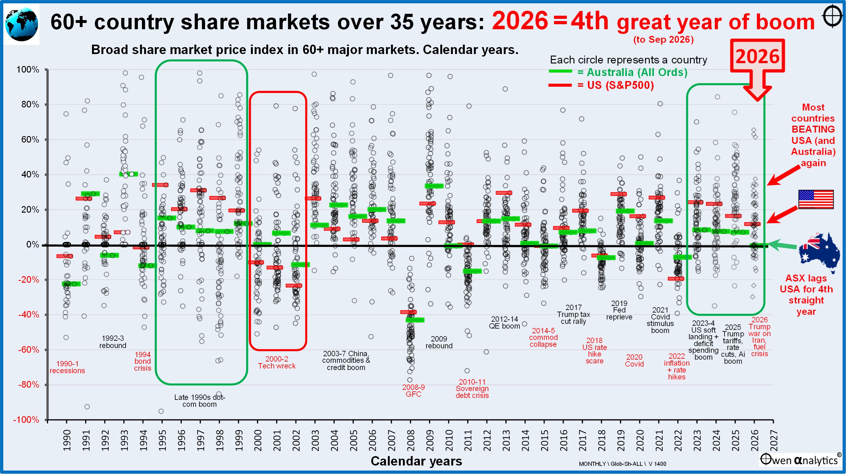
Today’s chart shows broad stock market indexes per calendar year in 60+ major country stock markets around the world each calendar year since 1990. Each circle represents the gain or loss for the broad stock market index in each country.
Each calendar year is a column, starting from 1990 (far left column) to 2026 to date (far right column).
In each yearly column I highlight the US (S&P500 index, red bars) and Australia (All Ordinaries index, green bars), to show how they stack up against each other and against other global share markets each year.
Global market contagion
I mainly use this chart to illustrate the fact that share market booms and busts are global phenomena. As the US has the world’s largest economy and capital markets, what happens in the US echoes in other markets around the world, regardless of local conditions and pricing in each country.
When US shares are booming, global investors (which are mainly US investors) spray money around the world and virtually all markets benefit, regardless of local conditions or pricing in each country. Confidence is contagious.
Conversely, when US shares are tanking, global investors (ie US investors) panic and pull their money back to the safety of US cash and US treasuries, which drags all markets down. Pessimism is also contagious.
The current boom is being led by big US tech/Ai stocks, and the general confidence (or over-confidence) is lifting share prices around the world, regardless of local conditions or pricing.
Australian more over-priced than US
The Australian share market is actually even more over-priced than the US market in the current boom. Although the Aussie market appears less over-priced than the US on some common metrics (eg lower price/earnings ratios, lower price/book ratios, higher dividend yields), our much lower profit margins, lower returns on equity, and lower profit growth rates make it even more over-priced than the US market. See -
· World share market pricing- Part 4: Profit Margins & Returns on Equity – US highest profitability, but is it sustainable? (26 Aug 2025)
The local ASX share market is being lifted way above its fundamental value by a flood of global money that doesn’t know any better. When (not if) the US market crashes, that global capital inflow will quickly reverse and the local market will fall along with the US and the rest of the world.
Australia lags
We can see from the green and red bars each year on the chart that Australia is lagging the US by a big margin again for a fourth year.
Several reasons for this.
First, we have a tiny tech sector. Our market is dominated by the over-priced dinosaur banks, and big miners at the mercy of global commodities prices, rising costs and an emboldened China putting pressure on prices.
Many of our other big local stocks have been hit by own-goals – eg international problems for companies like CSL, Sonic, Cochlear, Aristocrat, Amcor, Hardie, Reece, Domino’s, Xero, Lendlease. ‘Ai’ fears are dragging down REA and CarSales, and more own goals from our main ‘tech’ star, Wisetech.
Plus Australia has higher inflation, higher interest rates, higher taxes, more intrusive / stifling government, and more expensive, time consuming, crippling red / green / black / white tape.
· Australian share market has LAGGED the rest of the world for the past 17 YEARS! Our ‘Home Bias’ is costing investors dearly (11-Aug-2026)
· Reason 1 for the ASX’s 17-year lag behind global share market: SECTOR MIX (17-Aug-2026)
· Reason #2 for ASX’s 17-year Lag behind global share markets = chronically LOW RETURNS ON EQUITY (20-Aug-2026)
Is four years of boom too long?
Four-year share market booms are not unusual. There have been plenty of longer booms in past cycles, including some shown on the chart.
For example, the five-year ‘dot-com’ boom in the mid-late 1990s (highlighted in the green box on the left of the chart), which ended in a three-year ‘tech-wreck’ in 2000-2 (red box). The US beat Australia in the boom years, but then suffered a deeper and longer bust than Australia.
Likewise, there was a five-year boom from 2003-7, which ended in the 2008 GFC sell-off. In that cycle, Australia beat the US in the boom years (we had a credit boom like the US, but we also had a China/commodities boom), but Australia consequently suffered more in the GFC sell-off and took much longer to recover.
The higher and longer the boom, the deeper and longer the bust.
Another example on the chart is the US leading Australia and most other markets in the three-year boom in 2019-20-21 (Trump tax cuts, rate cuts, Covid stimulus), but then suffering more heavily in the 2022 rate hike sell-off.
For a summary of every boom-bust cycle in the past 100 years in Australia and the US see –
· How long and how high can the current boom go? 100 years of boom-bust cycles on the ASX (14-Nov-2025)
· 100 years of boom-bust cycles in the US – where are we now? (19 Nov 2025)
Australia and US take turns
Australia and the US have taken turns to have the bigger boom and bigger bust. This is just their turn to have the bigger boom and the bigger bust. When the current boom collapses the US market will fall further and then it will be our turn next!
On Australia and US markets taking turns over the past century, See
· Australia v US share markets – it’s our turn next!
What about pricing?
Share markets everywhere are over-priced relative to fundamentals. But crashes don’t necessarily occur when or because markets are expensive. Crashes require triggers, and it may take a decade before the final crash unwinds the boom-time over-pricing.
On the subject of pricing - I have researched and written extensively about this, including my recent six-part series -
· Share Market Pricing – Part 1: How does your country rate? (11 Aug 2025)
· World share market pricing - Part 2: P/E ratios, Dividend Yields, Price/Book Values (17-Aug-2025)
· World share market pricing - Part 3: Forward P/E ratios and earnings growth assumptions – The US market is actually better placed than most! (20 Aug 2025)
· World share market pricing- Part 4: Profit Margins & Returns on Equity – US highest profitability, but is it sustainable? (26 Aug 2025)
· World share market pricing - Part 5: Growth in Profits & Dividends – Why USA leads & Australia lags (28 Aug 2025)
· World share market pricing - Part 6: What price growth? Ben Graham’s ‘PEG’ ratio & ‘8.5 rule’, plus two ‘sanity checks’ (7 Sep 2025
For how I am making up for the ASX lag in my own live ETF portfolio see –
· My ‘10-4 all-weather ETF portfolio’ doing well after two busy/lazy years, beating Big Super funds again by big margins (8-Jul-2026)
‘Till next time – safe investing and stay healthy!